Context
The Client
Perch is a professional network with a focus on academic and research opportunities. The company's founders saw that it was difficult to gain traction and find available positions in this space. Places such as LinkedIn and other networking sites are saturated with other industries and are not tailored to specific requirements and needs of research-based and academic careers. Through Perch, students and professionals are able to easily find and connect to research opportunities.
Perch approached me to design and create a logo for their company. They had a specific vision and branding developed in mind after cycling through previous designs and concepts that they were ultimately unhappy with. I was brought on-board for my step-by-step creative process that would allow their team to have more input at each stage of the designing process.
Objectives
Together, we identified that the key points for the final logo: relevant to the name Perch (as a 'bird perch'), simple, recognizable, clean, and not cartoon-esque.
Research
Likes & Dislikes
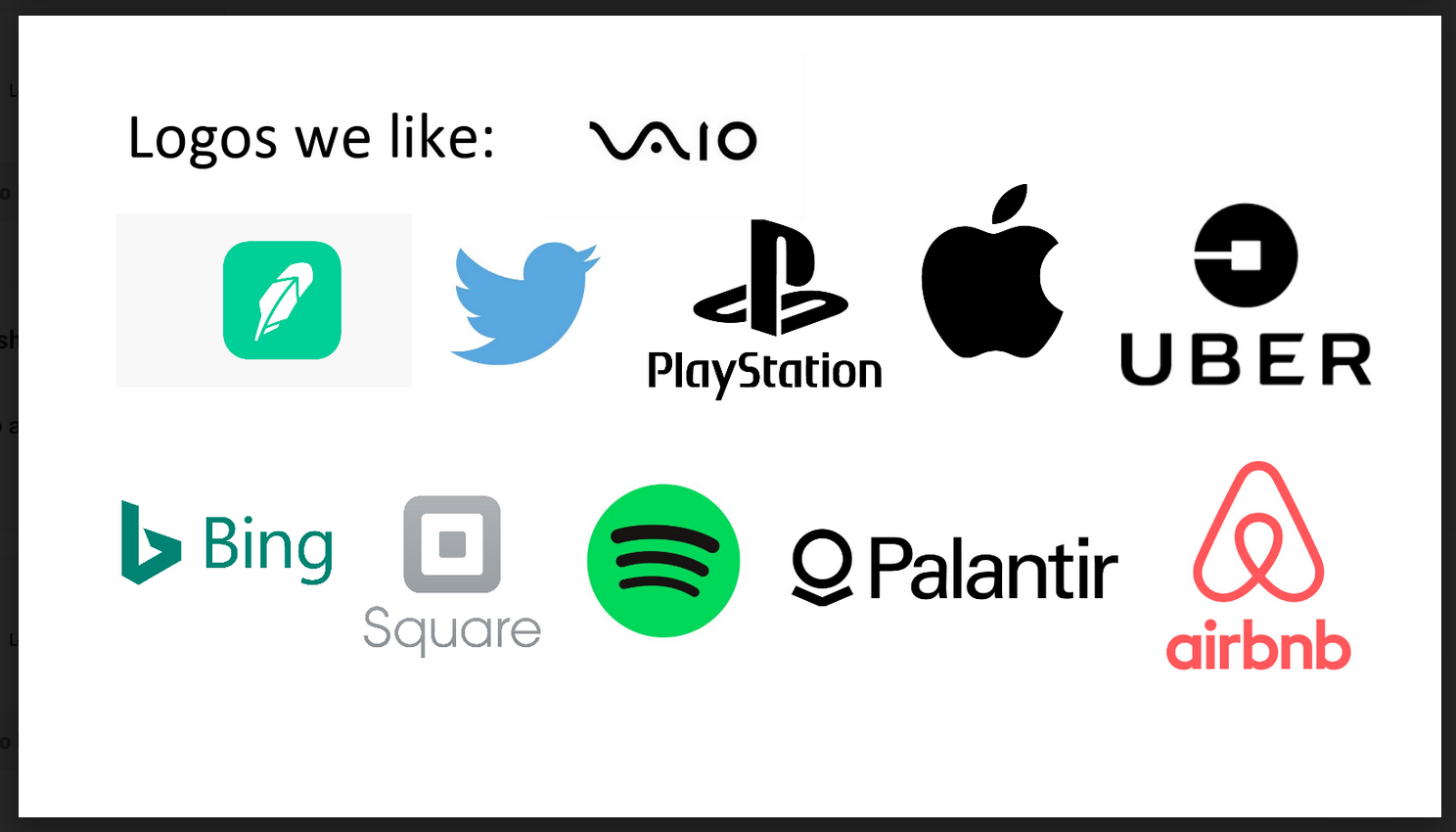
I asked Perch to compile a list of logos and/or branding directions they like. The Perch team came up with a list of logos such as Robinhood, Palantir, Airbnb, Uber, and Square.
Discussing the different logos and each company's unique nuances and creative choices, I was able to help the team breakdown exactly which design decisions they liked and disliked about each logo.
Some things they enjoyed were:
* Clever or double-meaning shapes and forms
* Simplified and minimized versions of real world shapes and objects
* Logo forms that evenly filled and maintained a square ratio
* Clever or double-meaning shapes and forms
* Simplified and minimized versions of real world shapes and objects
* Logo forms that evenly filled and maintained a square ratio
History
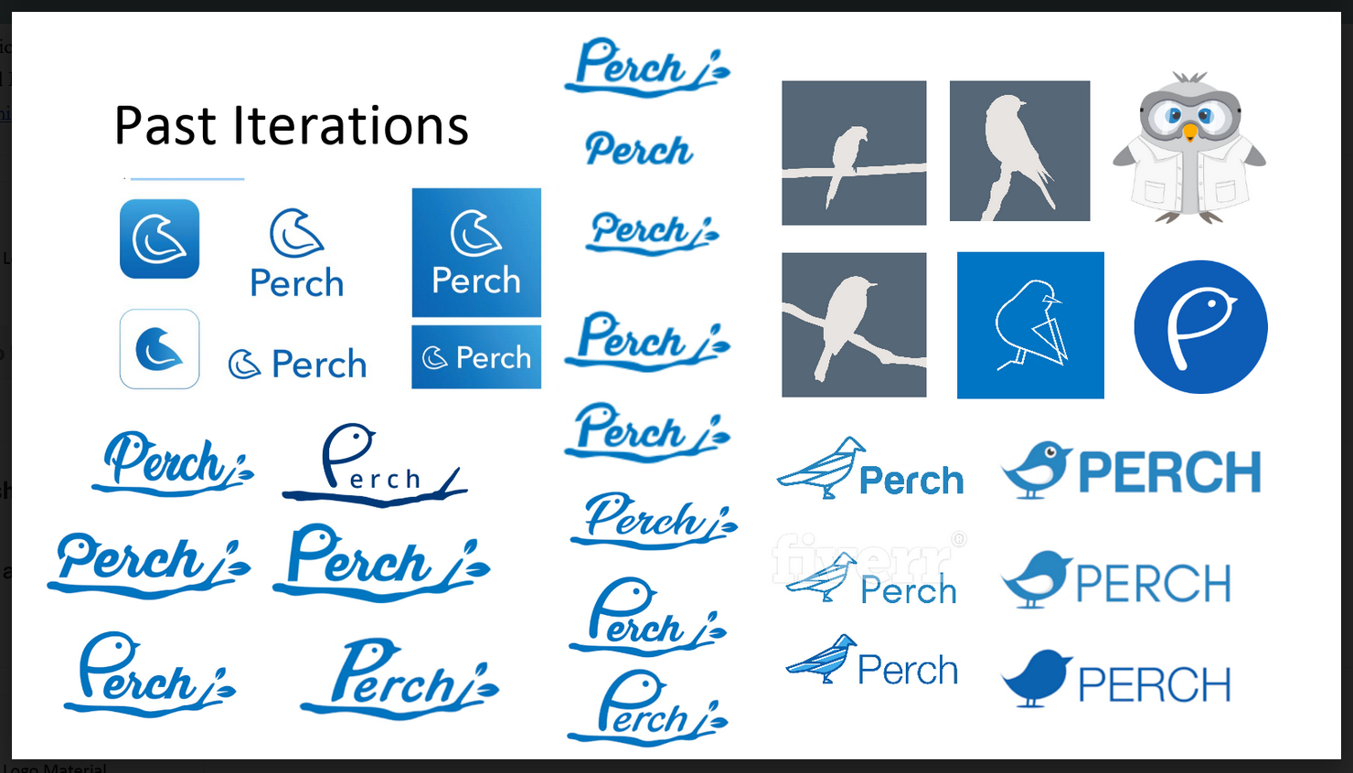
The Perch team supplied their history of previous logos they've used or considered and why those didn't work for them.
They described some logos as too playful, it didn't match the research-based subject matter, or too generic, as if taken from a free library of bird related clip art.
Another recurring problem also emerged, because Perch wanted to use the color blue while maintaining their bird based name, they had problems with separating their visual identity from that of Twitter. Since Twitter has iconized the blue bird symbology for its own identity, blue bird shapes similar in shape to that classic bird silhouette run the risk of competing with the much larger company for identity space.
Other logo forms depicted a bird on a perch silhouette well but were too detailed and didn't fit the sleek and clean look that the team wanted.
The team also provided what their current web design and platform UI looked like to give context as to what existing aesthetic they had going on and where the logo would be used in their product outside of marketing purposes.
Competition
To understand where Perch's logo would stand in the field, I did further research into competitive products. The Perch team gave me a good list of options to look into.
Other companies that had similar platforms or services tend to just use serif fonts to form a logotype and have no identifiable logomark. Serif fonts do well to pay homage to the academic scripts and research documents of the industry, as well as create a traditional and established look.
For Perch, they really wanted an identifiable logomark as well as a more modern look to their overall logo since their product was tailored to undergraduate and graduate students. With a younger user base it was important that the logo conveyed a less archaic feeling.
PROCESS
Sketching
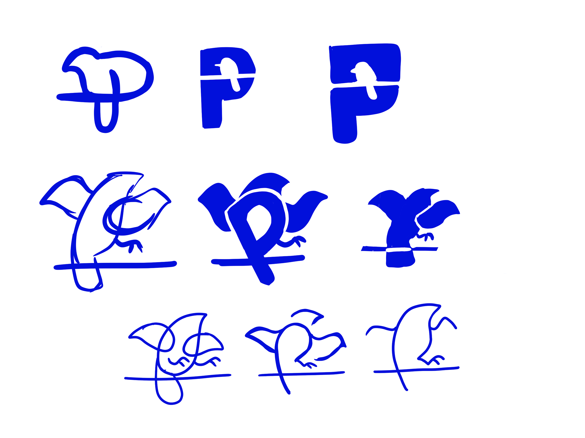
I started out the logo process by creating rough categories of different logo concepts and directions. I just free sketched, coming up with shapes and ideas through a stream-of-consciousness drawing process. I isolated the individual ideas that I thought were worth pursuing. This part of the process is mainly about getting as many ideas down as I can.
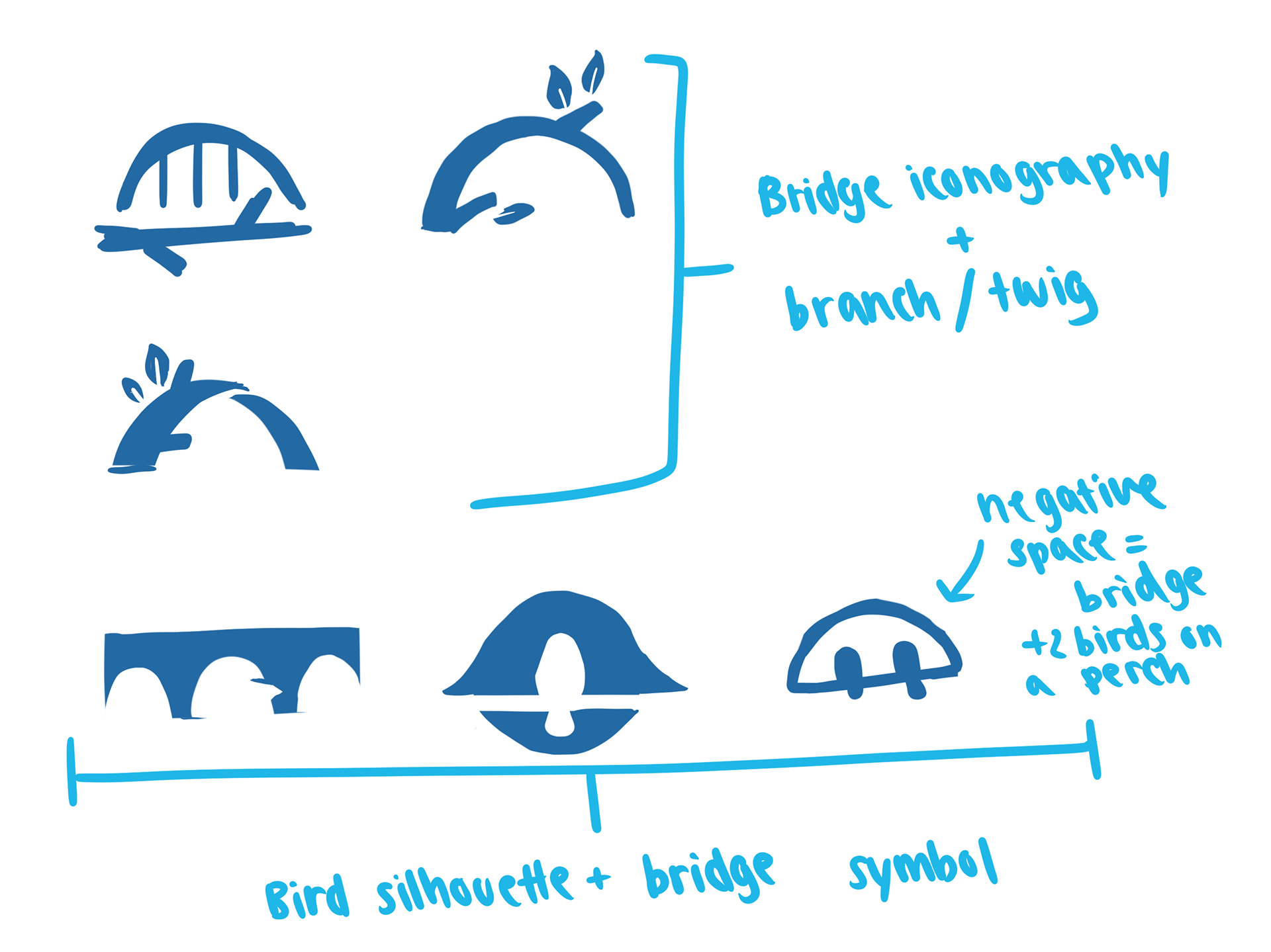
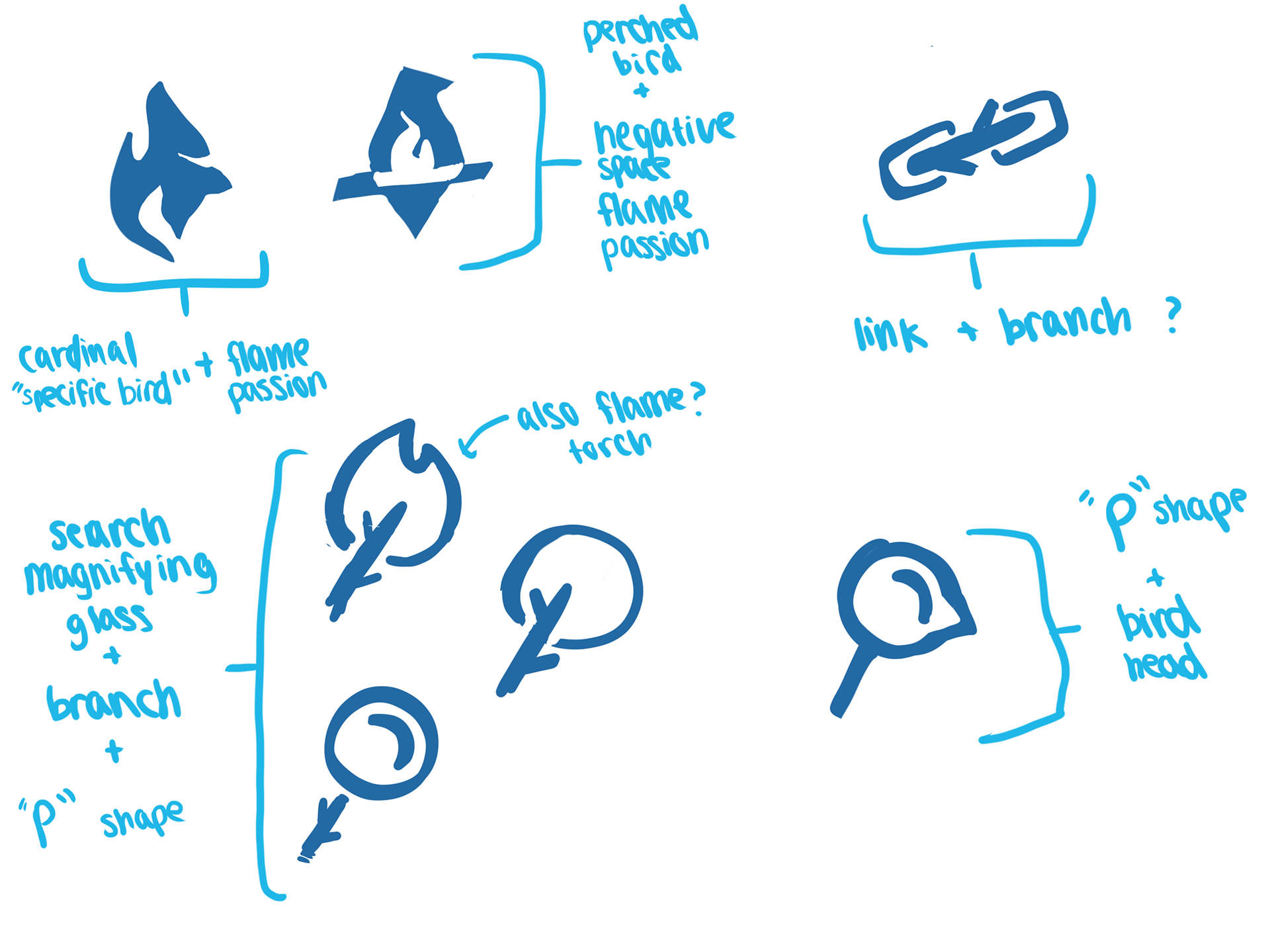
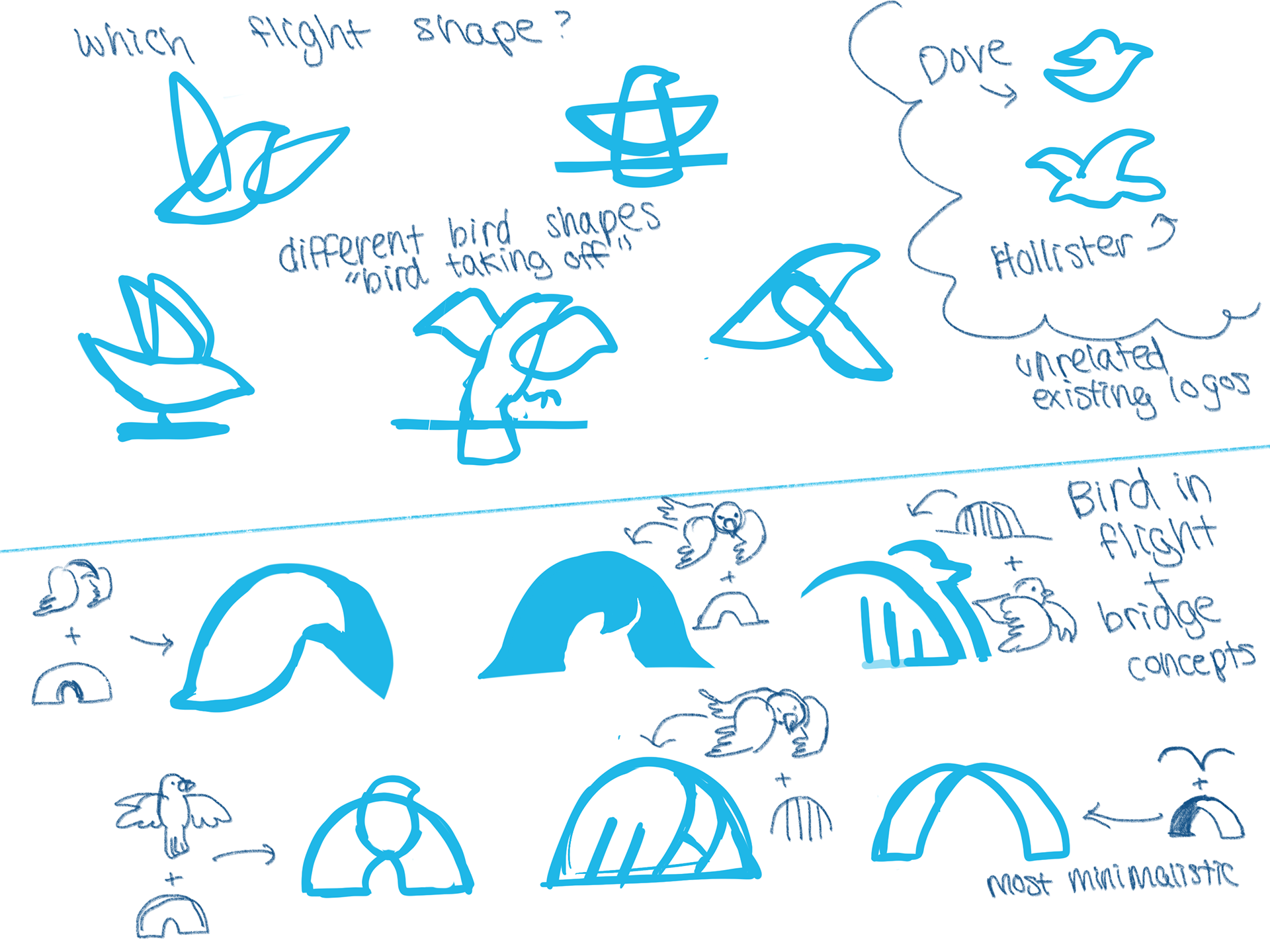
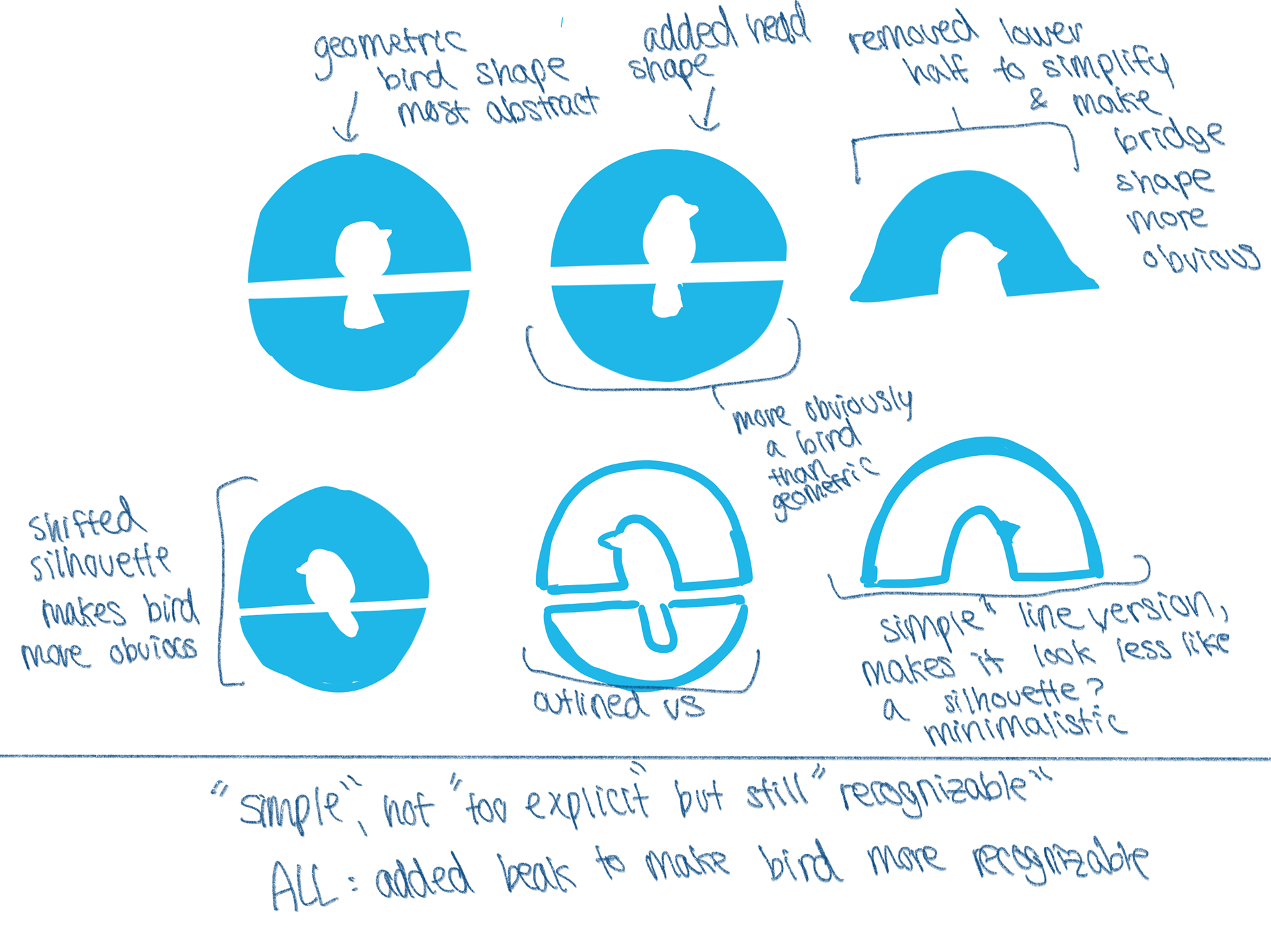
The Perch team pointed out with initial concepts they liked and which ones they wanted to see more iterations and explorations of.
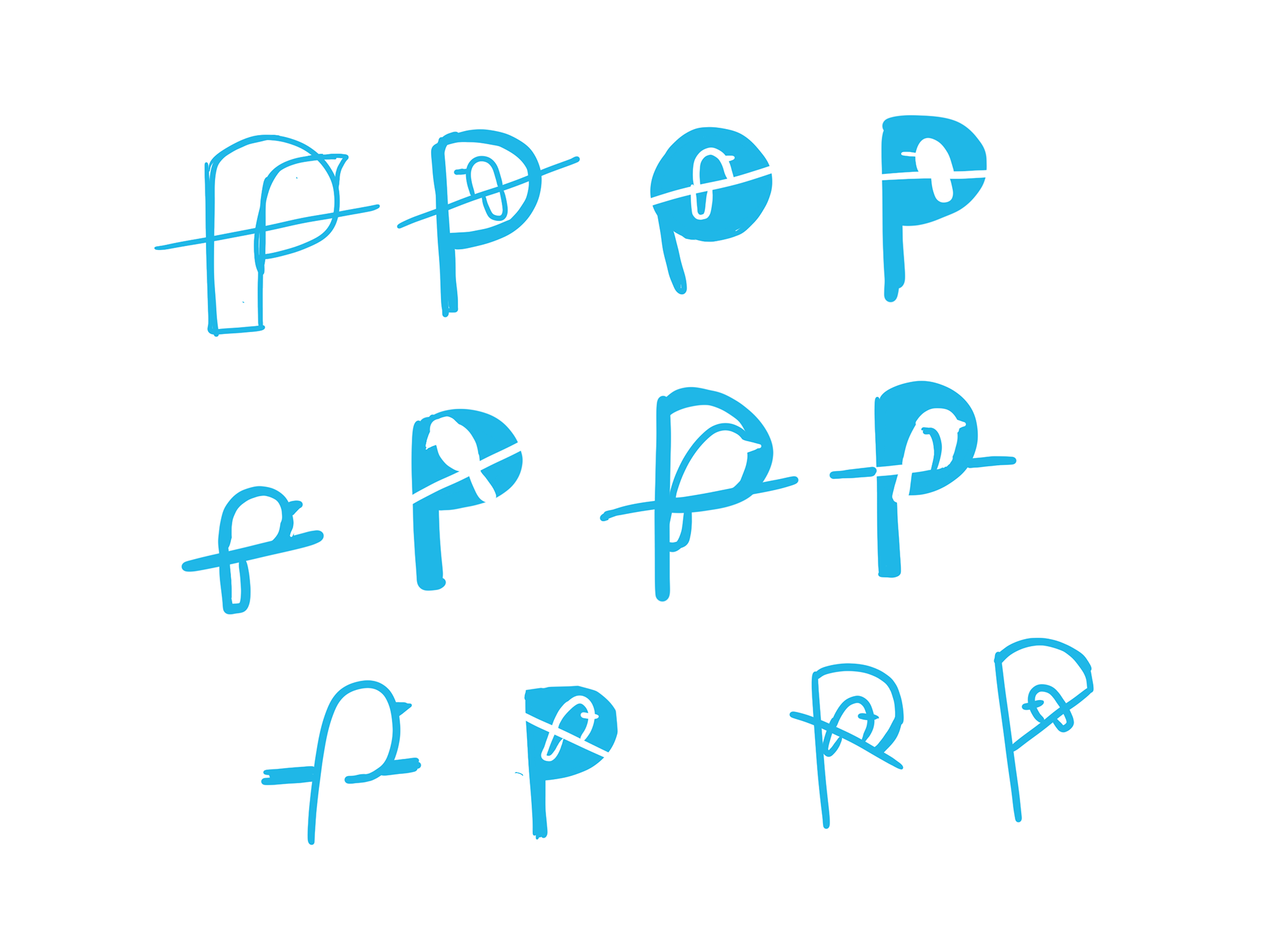
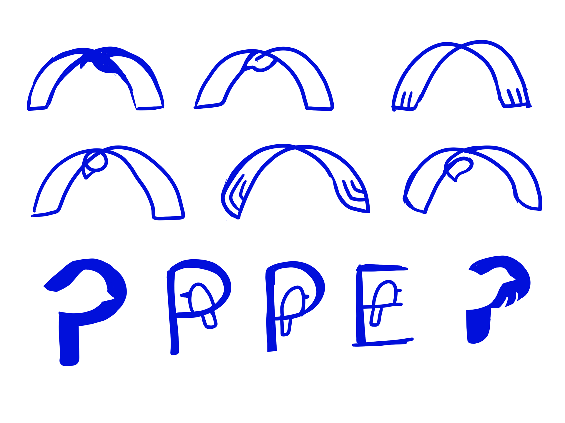
I continued to sketch and throw out loose ideas as well as iterate on top of concepts they selected. I continued to try out new ideas and directions with the bird-themed logo, and the team really stretched the limits of my brainstorming.
Refinements
One idea we took further to a more high-fidelity state was one that didn't involve a bird shape at all. Instead the team wanted me to further refine the concept of a simplified birdhouse without it becoming too kitschy.
Minimizing the object to its core elements, I removed the pentagonal borders that make up the silhouette of a birdhouse and isolated the main shape of the entrance hole and the actual perch.
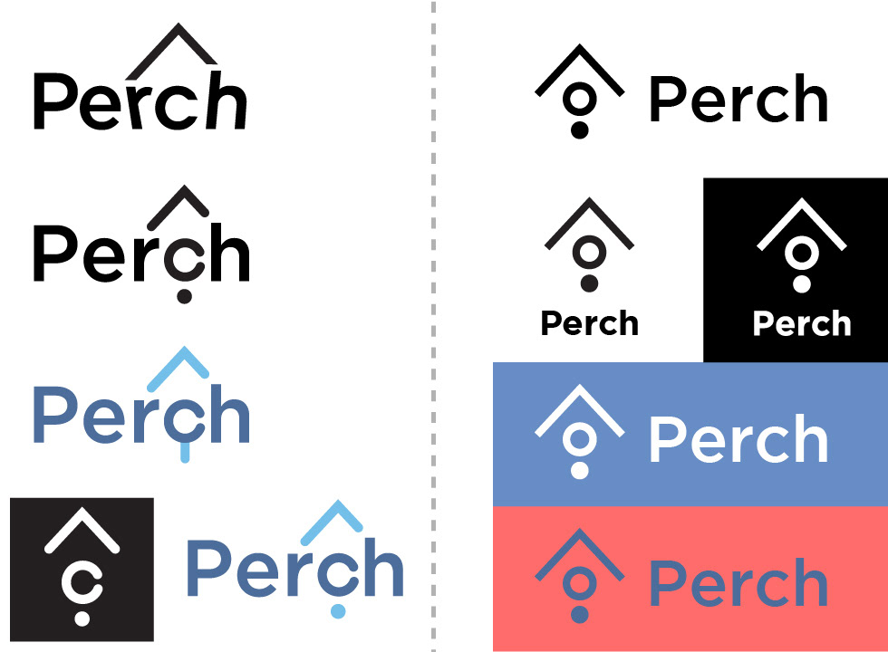

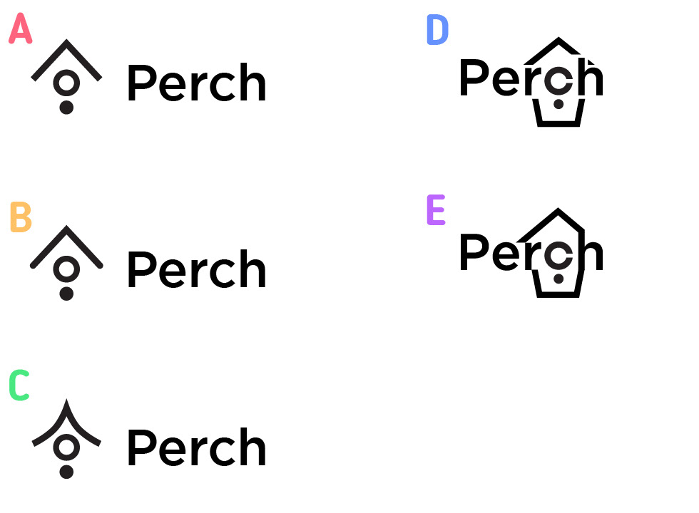
I tried different ways to integrate the form with the logotype but found the alternative ways to be unsuccessful and stuck with a traditional arrangement.
I made a mockup of what the final logo could look like on marketing and advertising products, here I placed it on a business card example.
After more refinements on what the team liked and didn't like, we found the final product to be too similar to Palantir's logo. The team also felt that overall shape looked precariously balanced on a point and easy to knock over. So we had to go back.
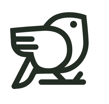
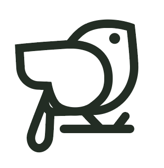
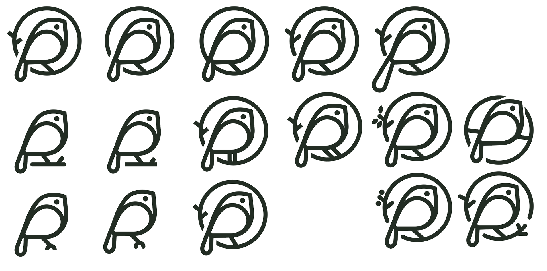
Tracing back a bit, we decided to try more variations. I tried different ways of abstracting a birdhouse as well as iterations of a bird resting upon the birdhouse perch.
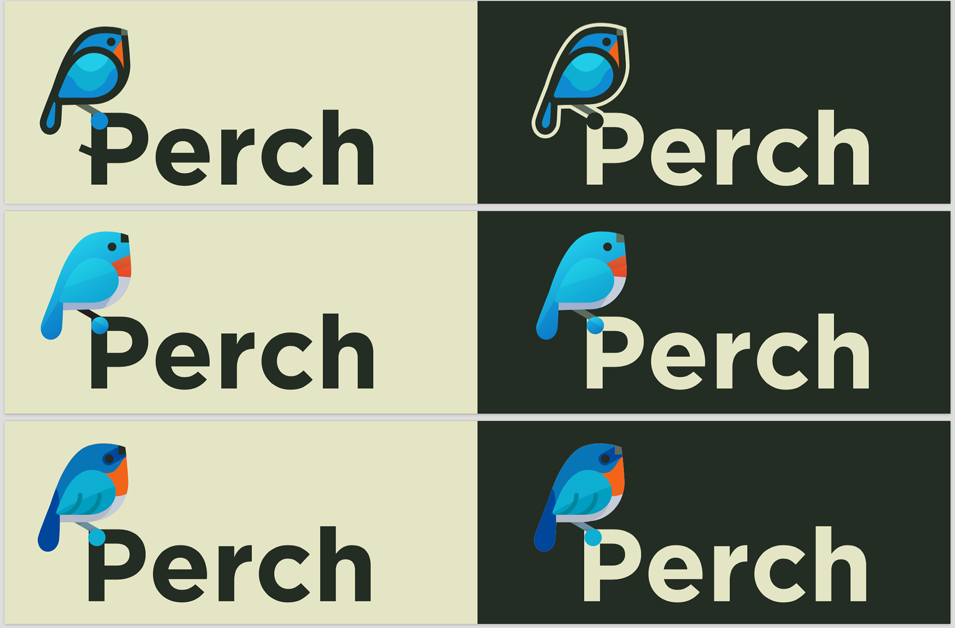
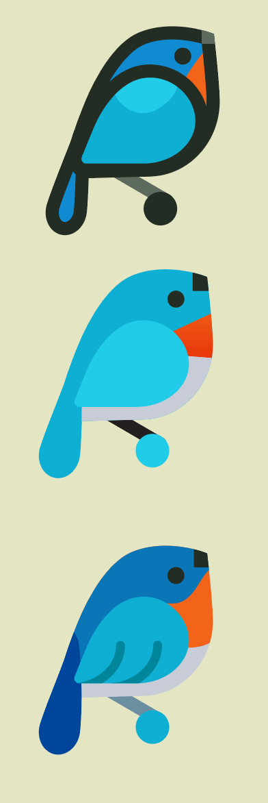
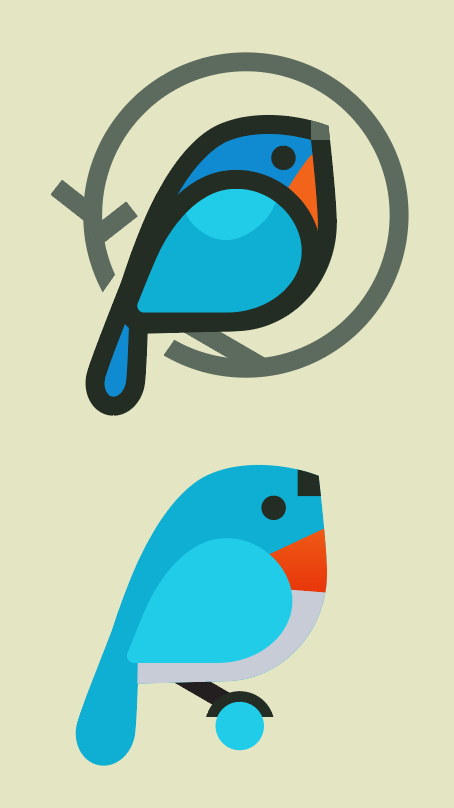
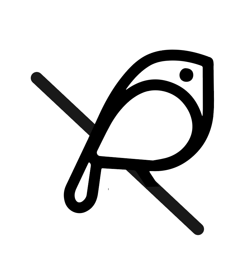
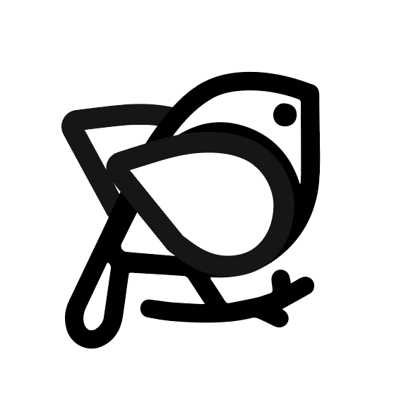
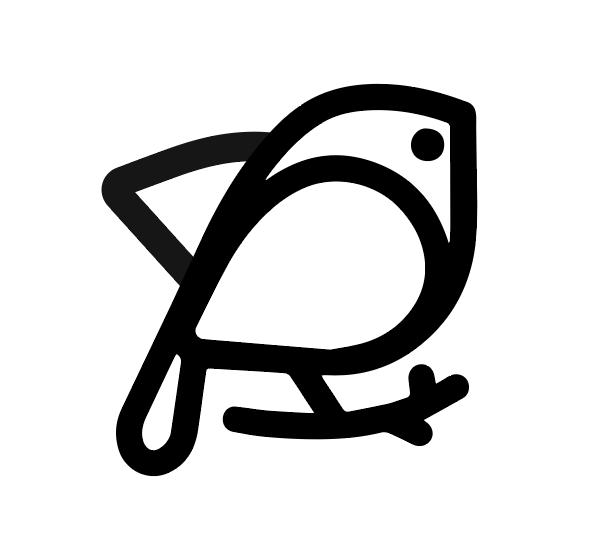
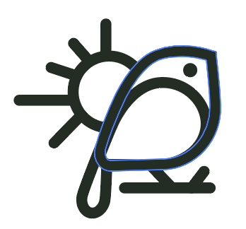
We ended up liking the more simplified bird built out of shape outlines and I refined it further to give them an example of what a colored version could look like. The silhouette of the bird avoided similarities to Twitter's bird with outstretched wings since this bird shape had a perched position.
Final Result
After a lot of further refinements and minor decisions, I tweaked and honed in on "the bird on a branch perch" idea. I ended up being quite happy with the final result after struggling with creating so many iterations for the Perch team. This is the final logo I designed.
FUTURE
Usage
This logo is now officially used across their website and social media pages at perchresearch.com. It's very exciting to see the design be put into use across platforms.
You can see below how the logo has been used on their web platform.
Retrospective
Going into the project, I knew of the client's previous logo designs and how they were all not quite right and I was determined to revise and iterate until the Perch team was able to find a design that fit them perfectly.
Going forward though, I've learned a lot of things for my next project. While a big draw of my creative process is the client's very intimate access to the design process, I was checking in with the Perch team at almost stage and it was starting to artificially delay the design process. In the future, I would remove some stages of input and be more confident in my ability to decide on smaller details and present more finished products for the client to give feedback on. This would streamline the design pipeline and prevent reaching dead ended design iterations and having to loop back to sketching over again.
This logo creation process has been by far the most intensive logo creation process I've done. I am so excited to see the company develop and want to thank the Perch team for this wonderful design opportunity and their hours spent meeting with me.
