
Context
What is MAM?
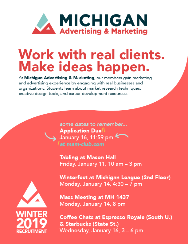
At Michigan Advertising & Marketing (MAM), our members gain marketing and advertising experience by engaging with real businesses and organizations. Students learn about and practice market research techniques and creative design tools in a real world setting. Members are placed in student-led Client Teams, working on marketing strategy and advertising campaigns for their designated client. The aim of the organization is to provide students with hands-on experience with real clients and businesses that they can bring to their intended career. The club accepts a diverse variety of students with a wide range of academic backgrounds.
I joined MAM my freshman year, becoming a part of the Executive Board in my sophomore year. As the Vice President of Creative Strategy I oversee MAM's personal branding, advertising, and lead the Creative Design Team, a separate group of students with specialized design skills, in executing creative strategy and media for our Client Teams.
For a while I have been planning to pitch a redesign of our old logo. I felt that there were many ways we could improve and refresh our rebranding, especially after notes from non-members saying that our branding was visually forgettable and bland.
Starting Point
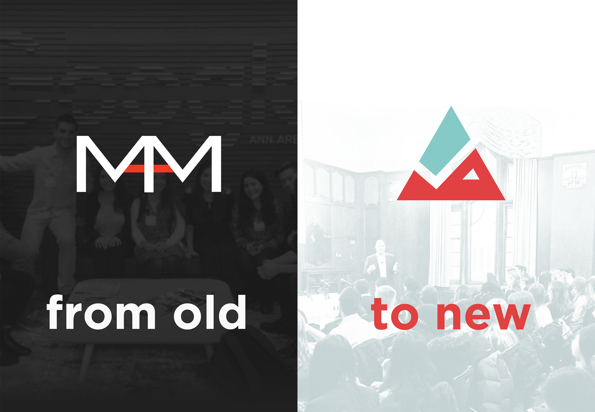
What I had: A stale and uninspired design that didn't pay attention to details
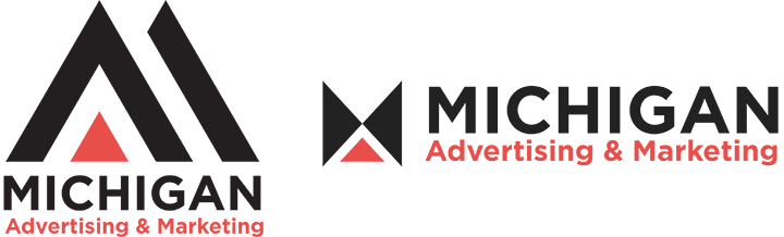
The original logo utilized the initials of our organization to form a logotype. Two M's are joined together by a shared leg and have red bars to create the shape of an A letterform within the M's, giving the logo a long rectangular shape. "Michigan Advertising & Marketing Club" is written below the logotype, with the capital letters highlighted in red. The hierarchy of colors made it difficult to read since the white/black colors of the rest of the text often stood out more than the red, causing our club name to look cut off at the beginning of each word.
Within the vector file that I was given, there were lots of small mistakes. The shapes are not properly joined together and each stroke of the M's are not even in width. The lack of attention to details and poor color choices, overall, made our logo and subsequent branding look unprofessional and boring. It didn't stand out. It didn't look inspiring or original. It didn't make students want to join us if we could barely market and advertise ourselves.

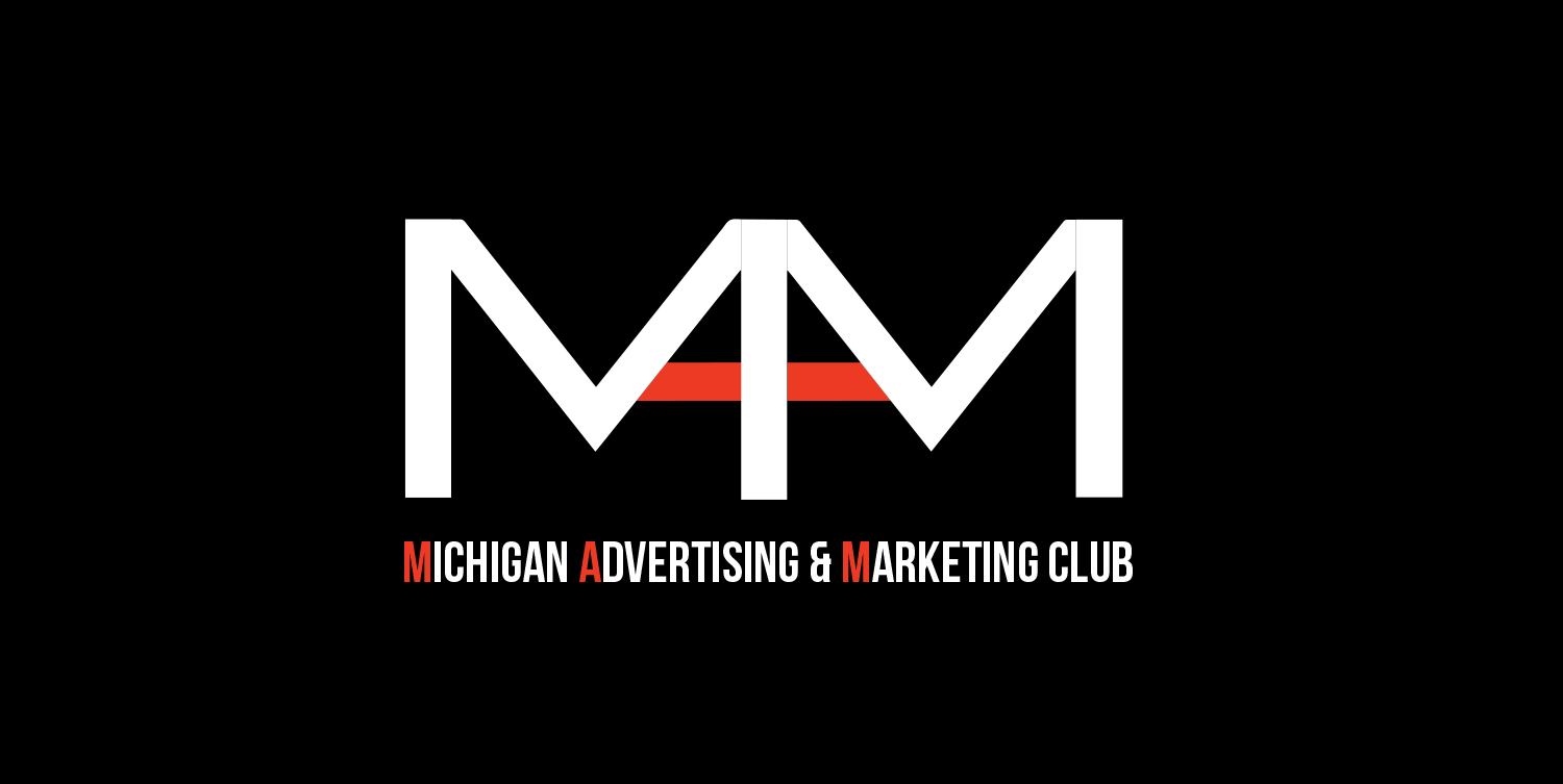
As you can see above, the gaps in the shapes of the logo are compounded and emphasized when placed white on black.
Our main typeface used was Bebas Neue, which was very vertically stretched and difficult to read at certain distances due to our long name making the letters even smaller and slim profile of the typeface.

Our colors were often inconsistent between our fliers, branding, logo, and website. Our website utilized a more muted red while other forms of MAM media used a bright vibrant red.
Re-Branding Process
Brainstorming: Rapid iterations of sketches and ideas
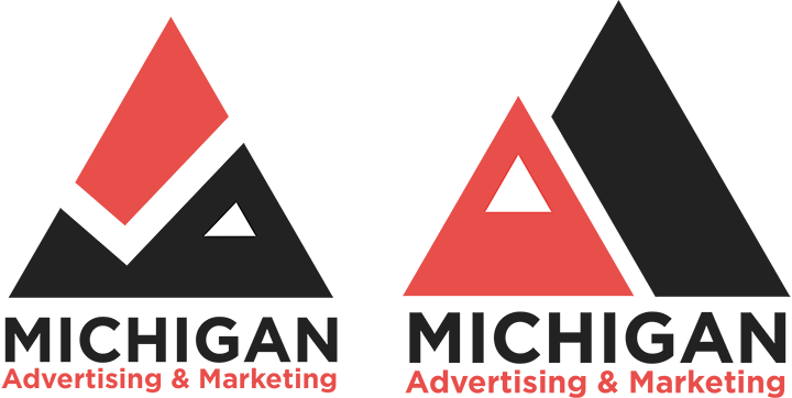
I doodled and sketched. I ended up sketching on napkins and scratch paper, playing around with the ideas of the M and the A. This led to the use of a lot of different triangular forms and shapes. Below are some of the iterations I ended up refining in Illustrator using our red and black color scheme.
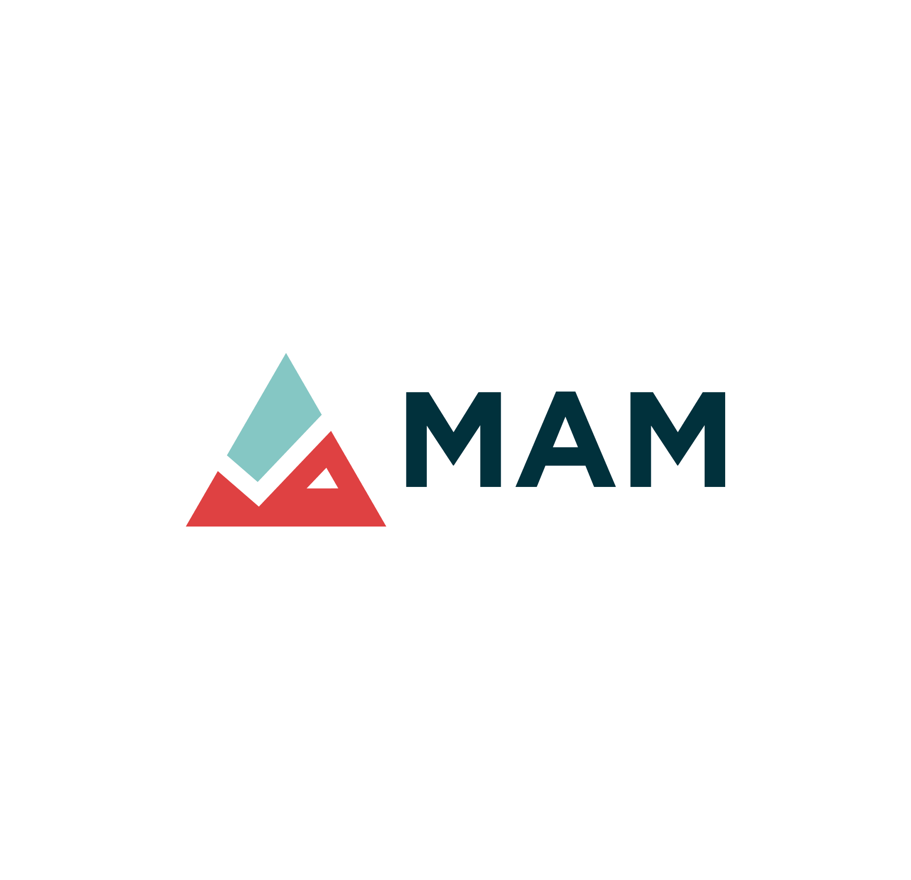
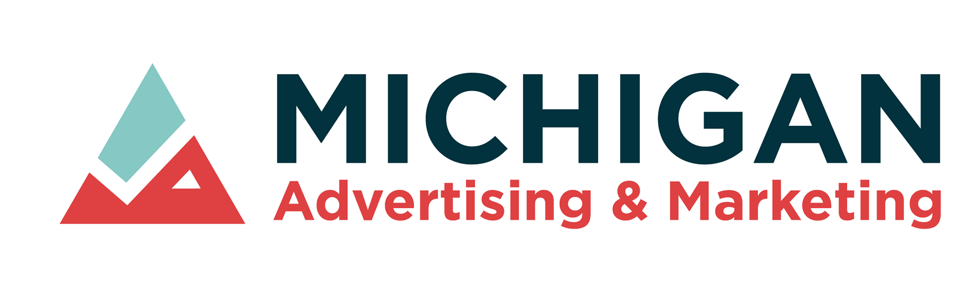
Showing the sketches to my co-vice president, we decided that the second iteration from the right was the best. I used the triangles to evoke the shape of mountains while maintaining an M shape. One of the mountain peaks is "snow capped" subtly hinting at an A letterform. The entire mountain silhouette fits into one equilateral triangle, with a checkmark of negative space separating sky and mountain. The check mark denotes getting things done while emulating a line of a statistical graph to reference the work that our organization does.
Goals: Bring a fresh and modern new look
We wanted MAM to look more professional and stand out from our competitors, which were other student organizations that focused on consulting work. While we specifically focus on the marketing and advertising field, students often considered us part of the consulting clubs and so our logo would end up being placed next to groups such as Nexecon and Bond Consulting.
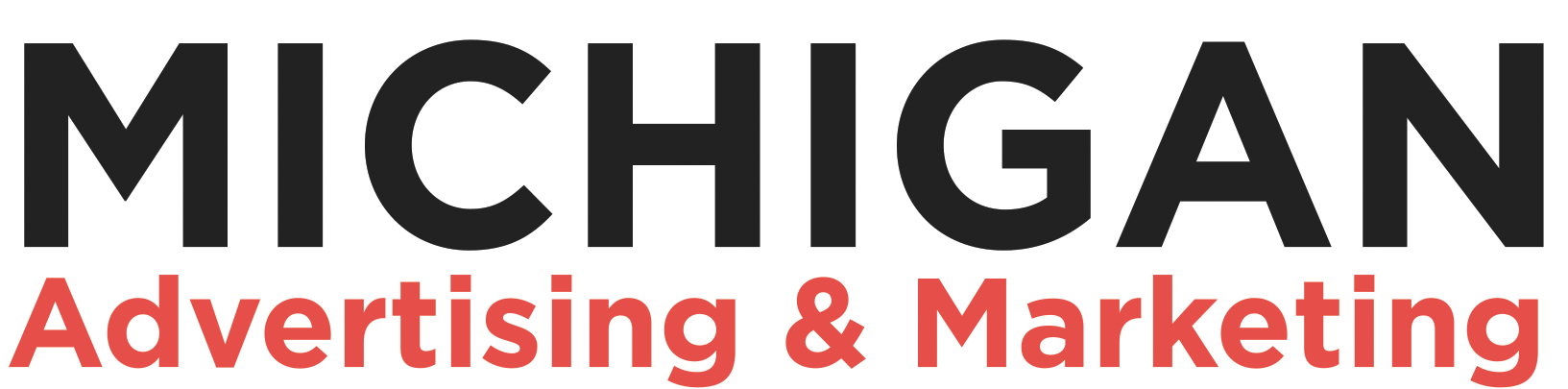
With our rebranding we were hoping to elevate our over look and feel while updating and modernizing our look. I changed our main typeface to Gotham to repeat the same strong geometric feel of the triangles in our redesigned logo, while maintaining legibility and balance in the weight of the letterforms. It looks more pleasing and is more functional as a font.
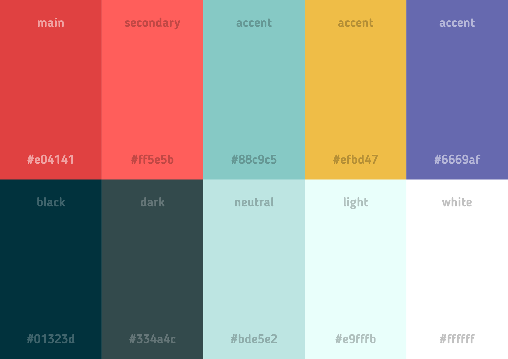
Color palette swap: Setting us apart from competitors and emphasizing our unique skills
After bringing the new logo idea to the rest of the E-Board, they mentioned how close our logo silhouette looked to another competitor's logo. Their logo utilized nested triangles and a black and red theme as well. We decided to change our overall color scheme, which was inconsistent anyway to be a bit more playful and to set us apart from other consulting clubs. The color scheme was chosen to represent a more creative and original side to MAM, with our Creative Design Team being an original feature of our organization that many other clubs did not have.
Final redesign: Creating a dynamic logo set and the appropriate media
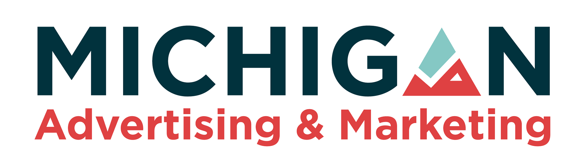
My final redesign package includes a dynamic logo set. The first logoform is shaded and detailed, meant to be used for large uses of the logo. As it scales down it goes through different versions of the text and logo interacting to be used for different media and dimensions. Ideally, the logo will always have a form that is best suited for the medium at hand.


New Media: Publicizing and advertising our rebranding efforts
We made sure to showcase our rebranding, and I created some visuals to advertise our new and improved look! It's crucial to make sure the consumers who knew us by our previous look could still follow our progress and recognize us after the rebranding. Therefore, we made a big effort on our social media and website to publicize and highlight our rebranding.
Overall, MAM's look and feel is brighter and more approachable. I wanted to retain a clean look, while introducing some more subtle playful elements to emphasize the influence of our Creative Design Team on our consulting process.
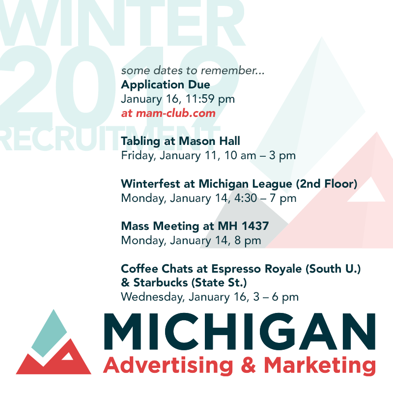
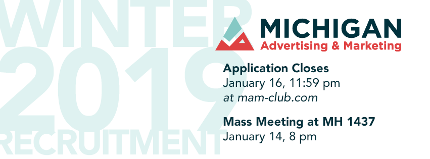
For our new recruitment season, I created brand new recruitment material that suited and utilized our rebranding material and new logo to its fullest potential. Our fliers looked bolder and more vibrant with more colors. Our new look ended up catching the eyes of many students during campus engagement events such as Festifall and Northfest.

Final Reactions: Enthusiastic and boosted interest
Many people were surprised by the big pivot and change in our redesign. I feel as if we were able to capture what originally inspired our old logo, the M and A letter forms and combine it with other themes and concepts that drove MAM forward such as accomplishment, new heights, and a creative side that was stifled in our old branding. Talking with new members and old members they felt that the redesign was interesting and compelling, making MAM more noticeable and more polished.
The iterative sketching process was crucial to coming up with different ideas that were not cliche and overdone. It was only after drawing and doodling dozens and dozens of different triangular styled logos and playing around with different ways to represent the M and A letterforms that I eventually tried creating a mountain-esque icon. I originally struggled with coming up with a logo that wasn't overdone and easy to confuse with others or too simplistic and abstract to the point it wasn't representative of the organization. By persevering with the initial mass iterative stage, I was able to come up with many different options that I could explore and expand upon.
From the enthusiastic response at events such as Festifall and Northfest, the team noticed that freshening up our look and branding did wonders to boost interest in our organization. Our new branding contrasted against our competitors. Students specifically pointed out our brighter but not garish colors that stood out from other consulting groups.
Thank you to everyone on the Executive Board and the Creative Design Team for providing crucial feedback on the different steps and iterations of the rebranding. I believe that a successful rebranding was a necessary step in helping breathe life back into MAM and further our reputation. Thankfully, we spurred a lot of renewed interest in our organization and attracted a lot of new hardworking talent among the undergraduate crowd.