Context
Interning at Gwydion
Over the summer of 2018, I had the opportunity to work at Gwydion, a virtual reality software company. The main platform they've been working on, Arthea, allows users to view, manipulate, and edit 3D content collaboratively in virtual reality. With their distinctive stag based logo, I was excited to have a chance to work with and expand on their existing branding. The Gwydion Design Team effectively consisted of my supervisor Gus Schissler and myself, and this was a chance to see how I functioned and contributed to a fast-paced small team environment.
Expanding and adding to Gwydion's existing branding
Gwydion already had a very cohesive look and feel developed when I arrived as an intern. With a unique and vibrant color scheme and established logos for their company and main platform Arthea, it seemed a lot of my work would be growing their foundation and see what unique but appropriate design elements I could introduce.
As the summer began, my supervisor Gus Schissler first tasked me to look around Gwydion's existing social media and personal branding to see if I could grasp Gwydion's look and feel. Understanding their implicit design rules would be crucial to how I could grow what they had.
Beginning Projects
Merchandise Design: Understanding their current visual style and creating something new
After I had a look around Gwydion's website and social media, my supervisor gave me my first project: to iterate and create a variety of illustrations and designs for new Gwydion merchandise. To be printed on t-shirts, I had to keep in mind how to represent Gwydion accurately. Designing merch had a more playful direction and I had more creative freedom to play around with Gwydion's more humorous and irreverent side of their brand.
Sketching and iterating, I came up with five final ideas and concepts that the rest of the team could pick from. All with different concepts and directions.
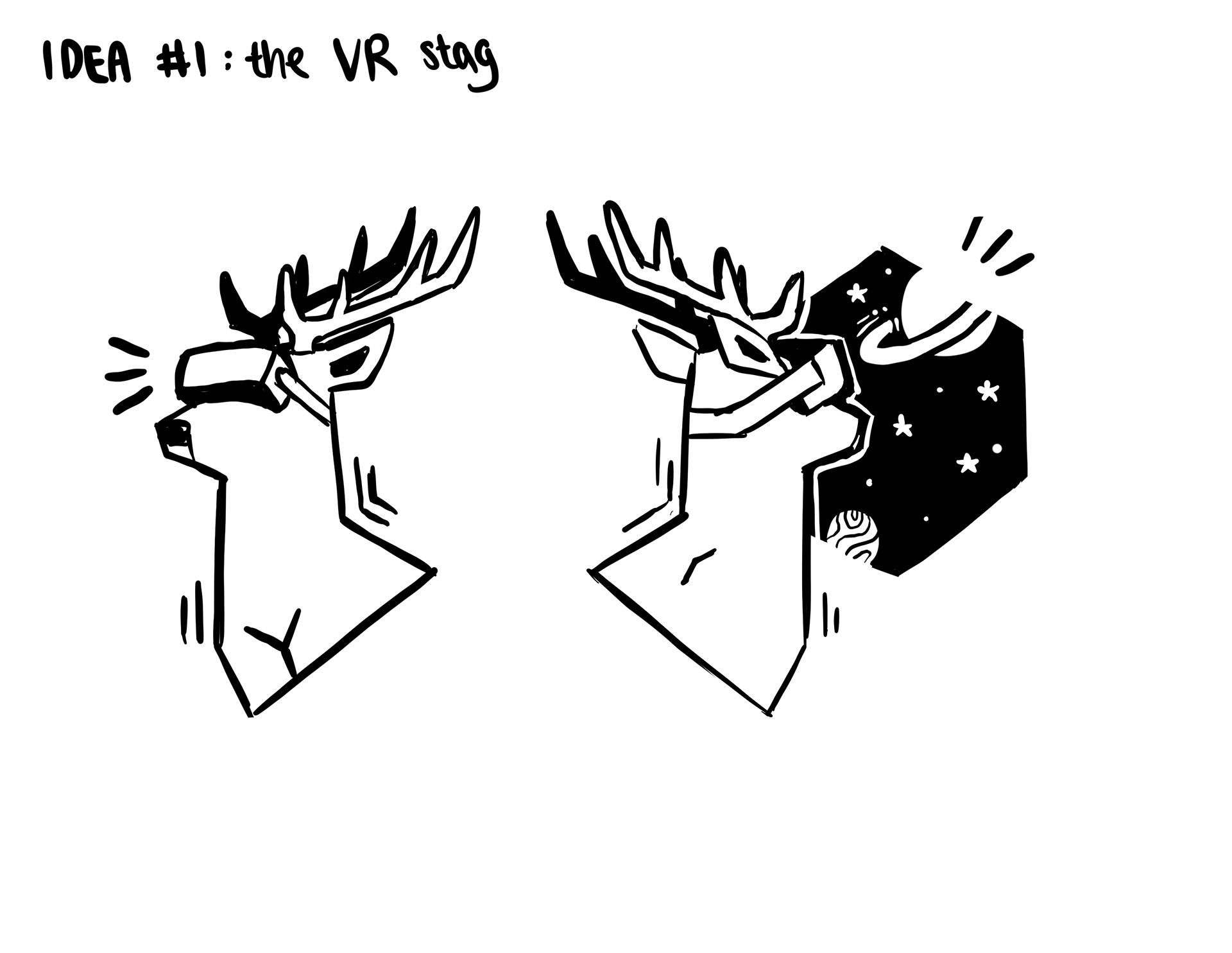
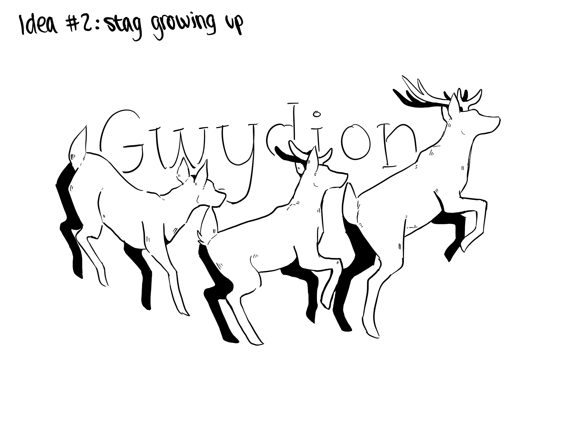

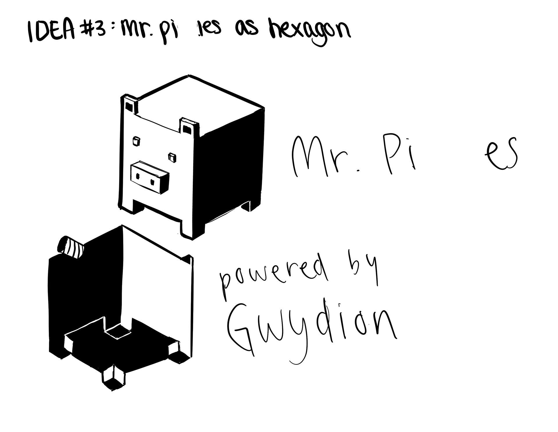
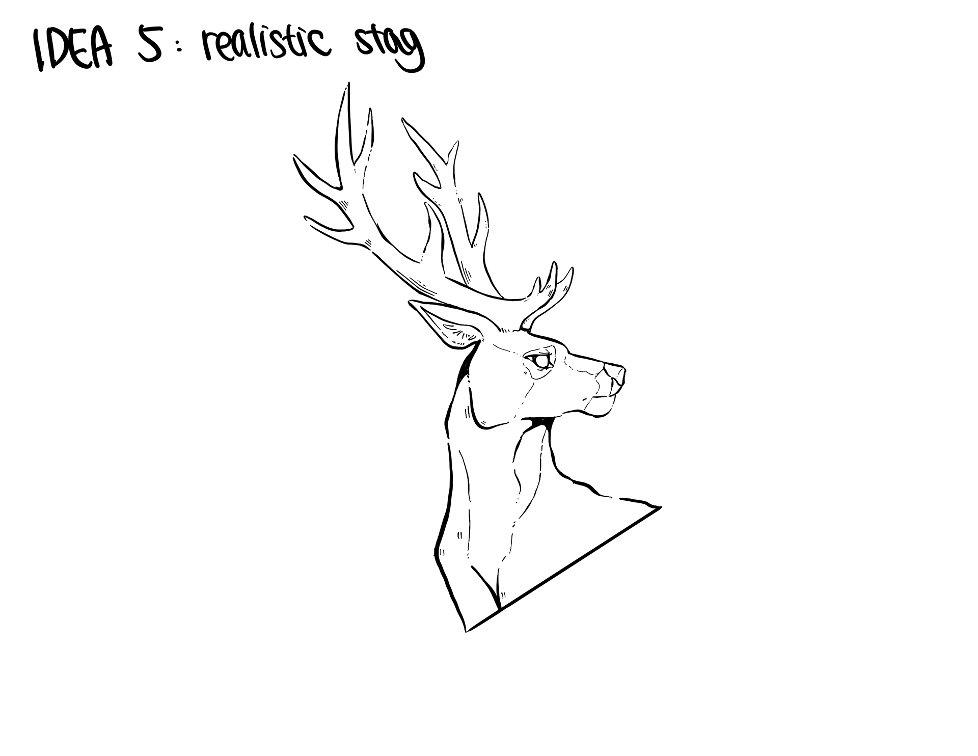
Ultimately, the team picked Idea #1 and Idea #4.
The first idea was a parody of their existing logo. Following the general shapes and proportions of their current logo, I created a humorous and graphically interesting concept of their stag mascot wearing the VR equipment of their industry.
The second idea the team chose was simply a stylized stag standing in the sunrise. More of a visually successful concept, I utilized the sharp angles and geometry of the Gwydion logo to stylize and create the strong lines of this concept.
Below is the final mockup of what the shirts would look like for printing.
Marketing & Advertising: Aligning our design with our humorous marketing
After creating t-shirt designs that the team really liked, I was able to venture further with introducing more illustrative elements into Gwydion's branding. It was here that I pushed the boundaries of Gwydion's look and feel, wanting to match our visual atmosphere with the company's punchy and witty tone of voicce.
A lot of what Gwydion publishes on their website and marketing involve sarcastic or witty humor. As such I felt that the graphics they pushed out should include that same humor. The illustrations below demonstrate how I tried to utilize Gwydion's signature stag in different contexts and situations to match the accompanying advertising. I kept to the sharp angles and graphic lines that I felt made Gwydion's logo unique. The use of hexagons and geometry continue to show up in many different aspects of Gwydion's design.
I stuck with the vibrant and flexible color scheme that Gwydion already had to create rich and vivid illustrations that really draw the eye. It sets us apart from the monochromatic and pared down look many companies have gone for recently and adds to the voice and tone Gwydion's has cultivated thus far.
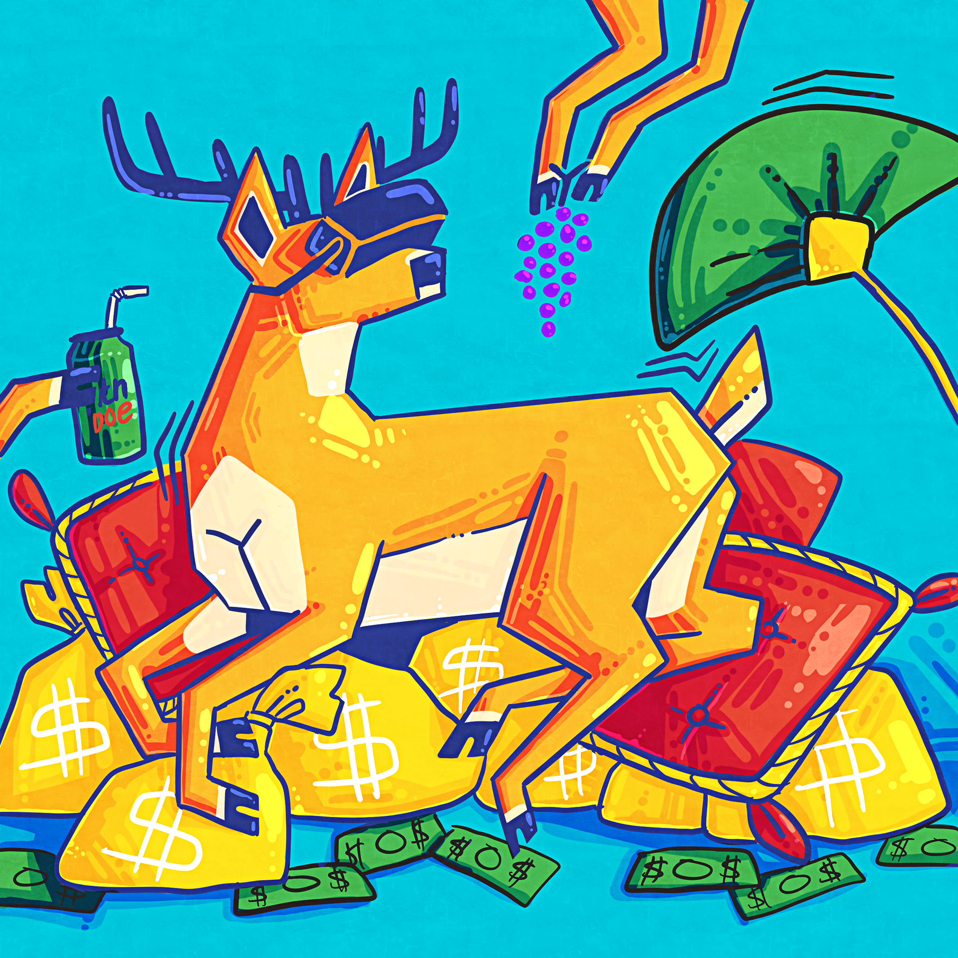
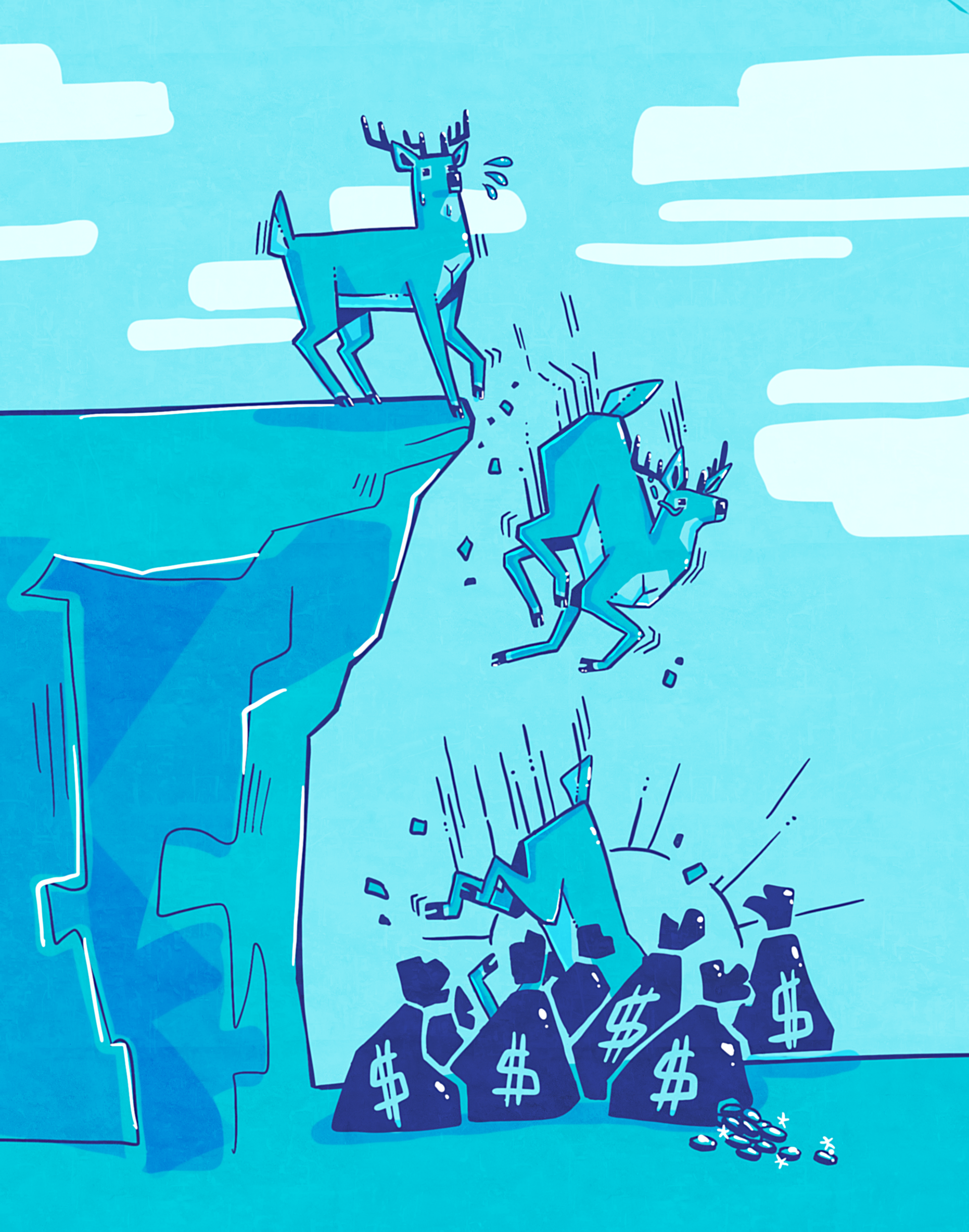
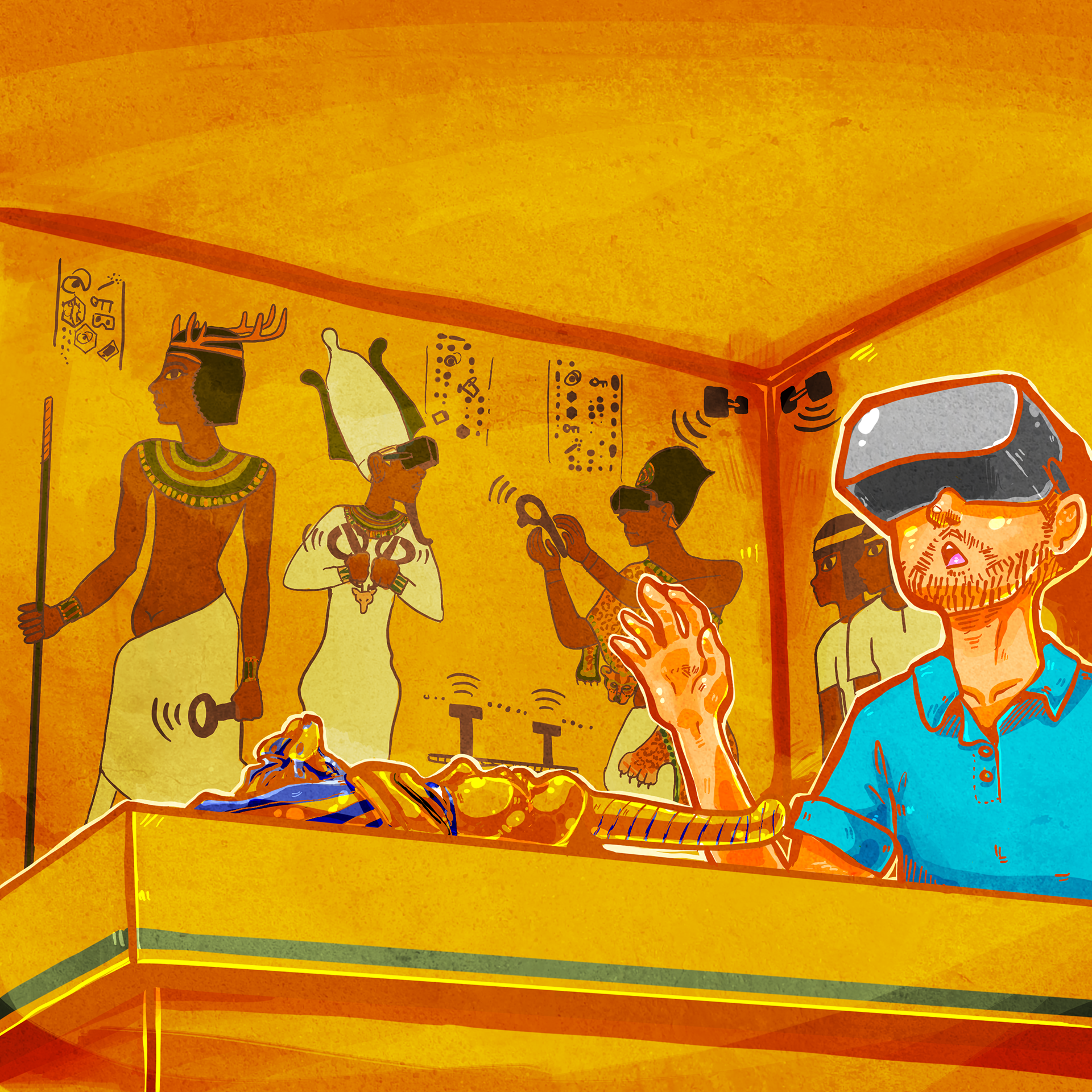
Virtual reality often has a context associated with the gaming industry, and similarly Gwydion had its start as gaming company. The very original conception of the company involved creating games and VR games in a medical context. To hone in on this unique story, some of my illustrations contain hidden easter eggs, a phenomenon popular in video games.
Social Media & Medium: Spearheading use of illustration in marketing and design
As I created and generated more content, the marketing team decided to make the move into expanding into Medium alongside our social media push, to blog and write content for our customer base, new users, and other individuals that are interested in such a new and emerging field of VR.
My job was now to "make it look pretty". I decided that using the original logo for something as personal as a company blog that's reaching out to our users would be too stoic. To connect with our customer base and prospective users, I believed that our blog should look especially personable and fun while still remaining professional.
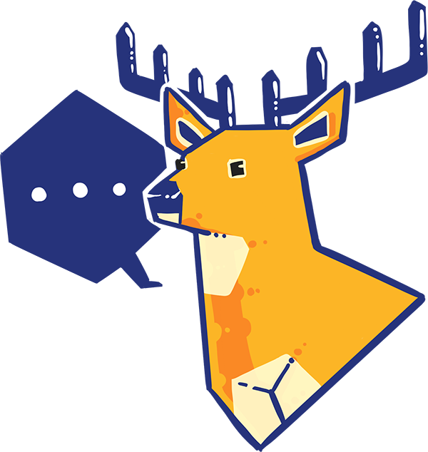
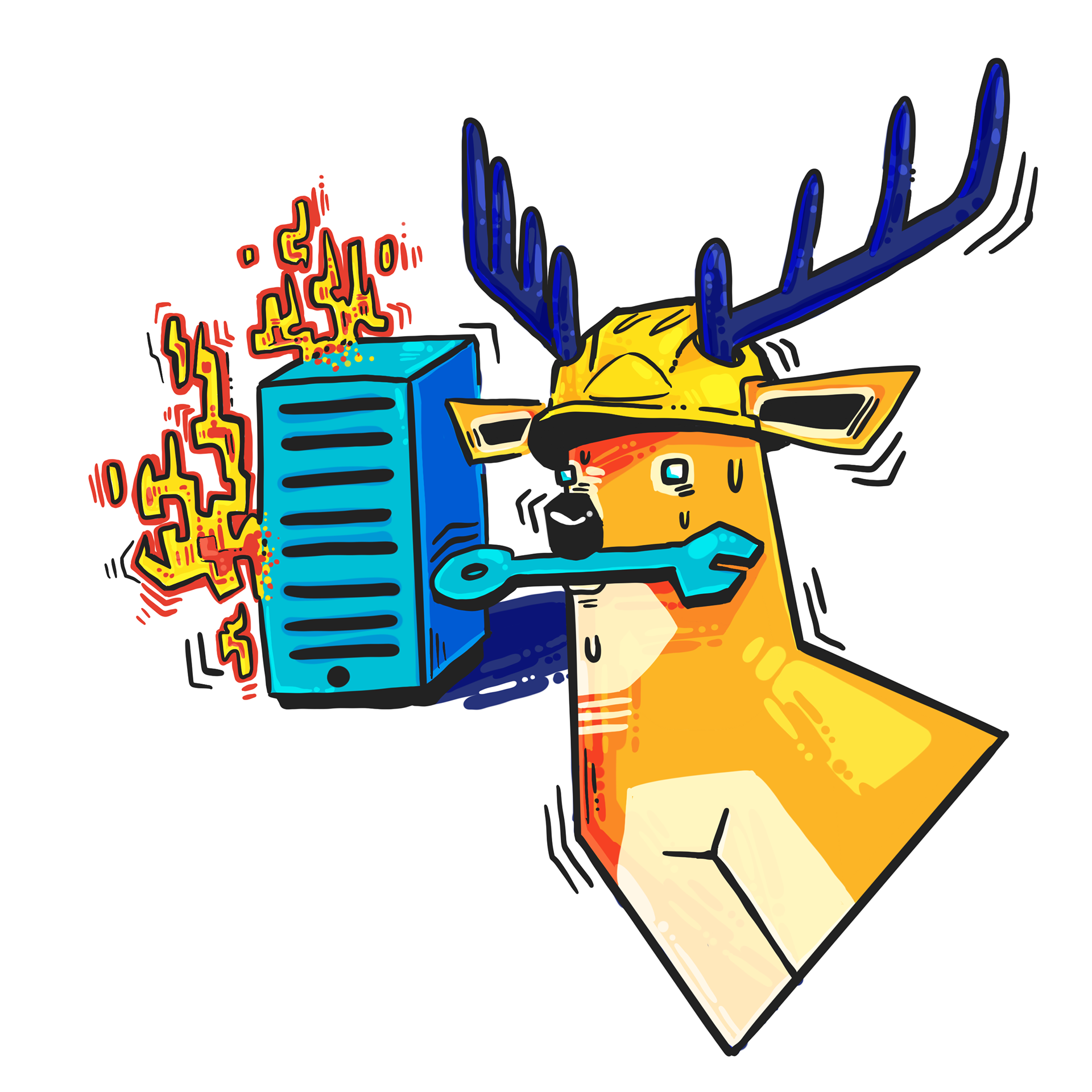
I constructed an illustrative version of our original logo and included a speech bubble to evoke the idea of discussion. Alongside this I included a "distressed stag" showing a server rack on fire to be used whenever any of our web pages failed to load properly.
Many times my ideas were conceived by listening to what my coworkers thought we lacked when exploring the website and translating that into compelling visuals.
Print Media for Investors: Designing the communication of information
During the summer we had to find a way to draw in potential investors interested in the company and communicate the uses and results of our technology and product accurately. My supervisor and I decided to tackle this design project together, and an important part of conceiving and new interesting ideas was iterating our ideas separately.
Having decided on a pamphlet form for print, below I have two different sketches and iterations I came up with for the final prototype. My main focuses were 1) How do we catch an investors eyes with the front cover?, and 2) How can we effectively communicate our technology visually? I was important for it to look appealing but still effectively use the space since there was so much to explain.
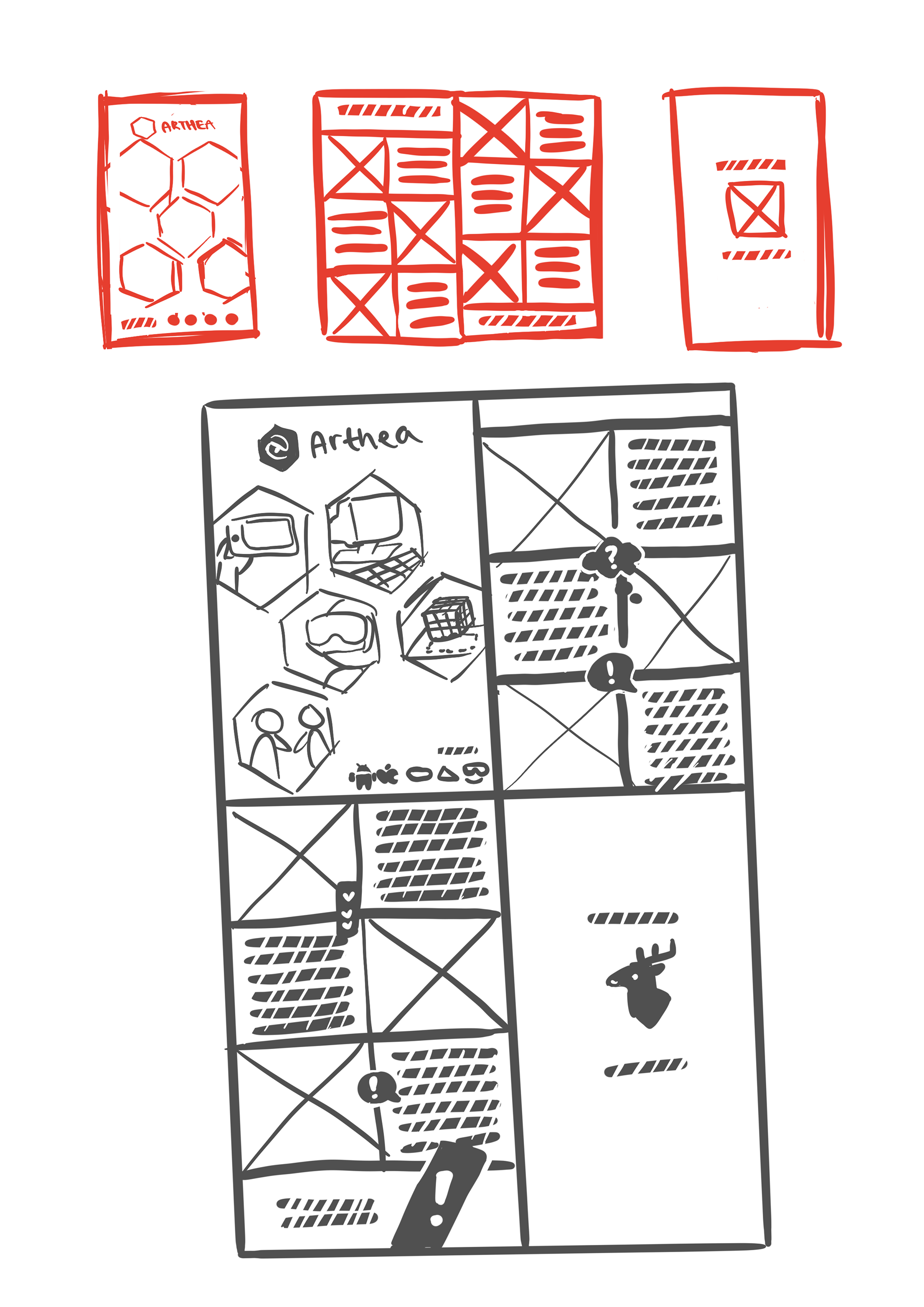
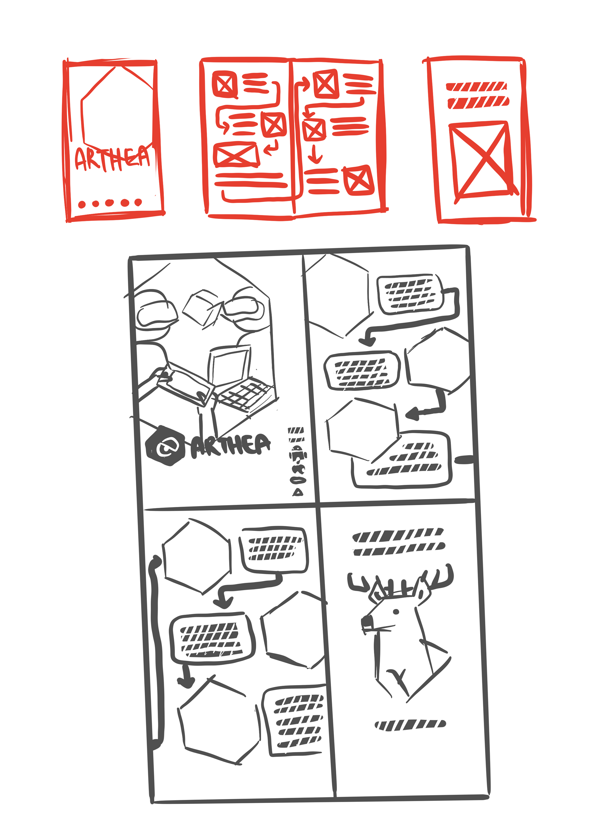
Coming together with my supervisor, we decided on my iteration on the right. I included heavy use of hexagons and strong geometry, solidifying our use of heavy geometry in branding and advertising.
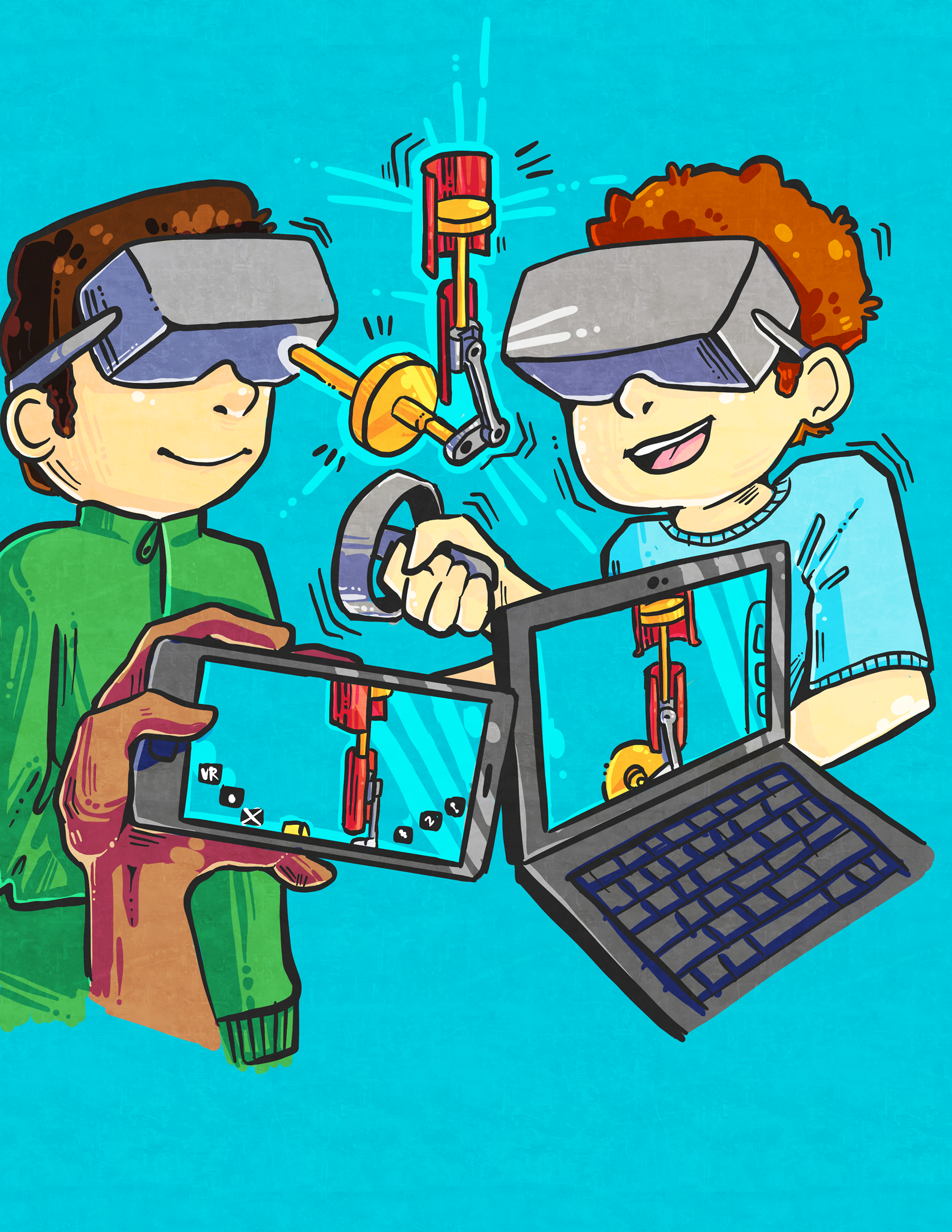
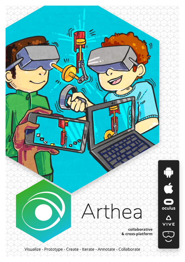
Proceeding forth, I created the illustrations that would be used in the pamphlet. The cover was illustrated with a hexagon border in mind, and the send off illustration included our stag mascot, the titular Gwydion, and the VR avatars we use in our platform, Mira. I kept the send off illustration more monochrome to have a balance between bright vibrant graphics and simple functional presentation of illustration.

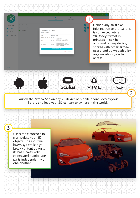
The final spread of pages appears below. While we kept many elements of the original sketch, we had to alter a lot of the hexagon shaped cropping and text boxes to rectangles. We found that while hexagons were visually interesting and quite different, rectangles and squares were ultimately functionally superior, being efficient in their use of space and familiar to readers.We decided against the use of illustrations for the actual explanation of our software and felt that screenshots were the more effective way to visually represent what our technology can do.

LARGER PROJECTS
User Manual Update & Redesign: Improving existing design for the user
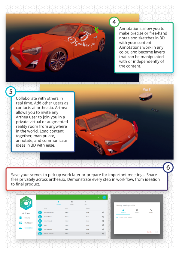
As our software developed and changed throughout the software, all this new progress was not covered under the existing user manual that Gwydion had for Arthea. My supervisor and I needed to update the existing user manual design to reflect the changes and improvements our engineering team had made to Arthea.
It was important for me to not only create new designs but improve upon old ones. This meant gauging what wasn't working before and re-evaluating the existing functionality for something as user centric as a manual and help guide.
My supervisor asked me for new illustrations to replace the ones we had before, since it seemed that our controls and button functionality often confused users and the previous illustrations had a difficult time showing all the controls of a three dimensional object. I created two different illustrations for different VR equipment, making sure to keep the color scheme consistent and the perspective optimal for understanding what button did what.
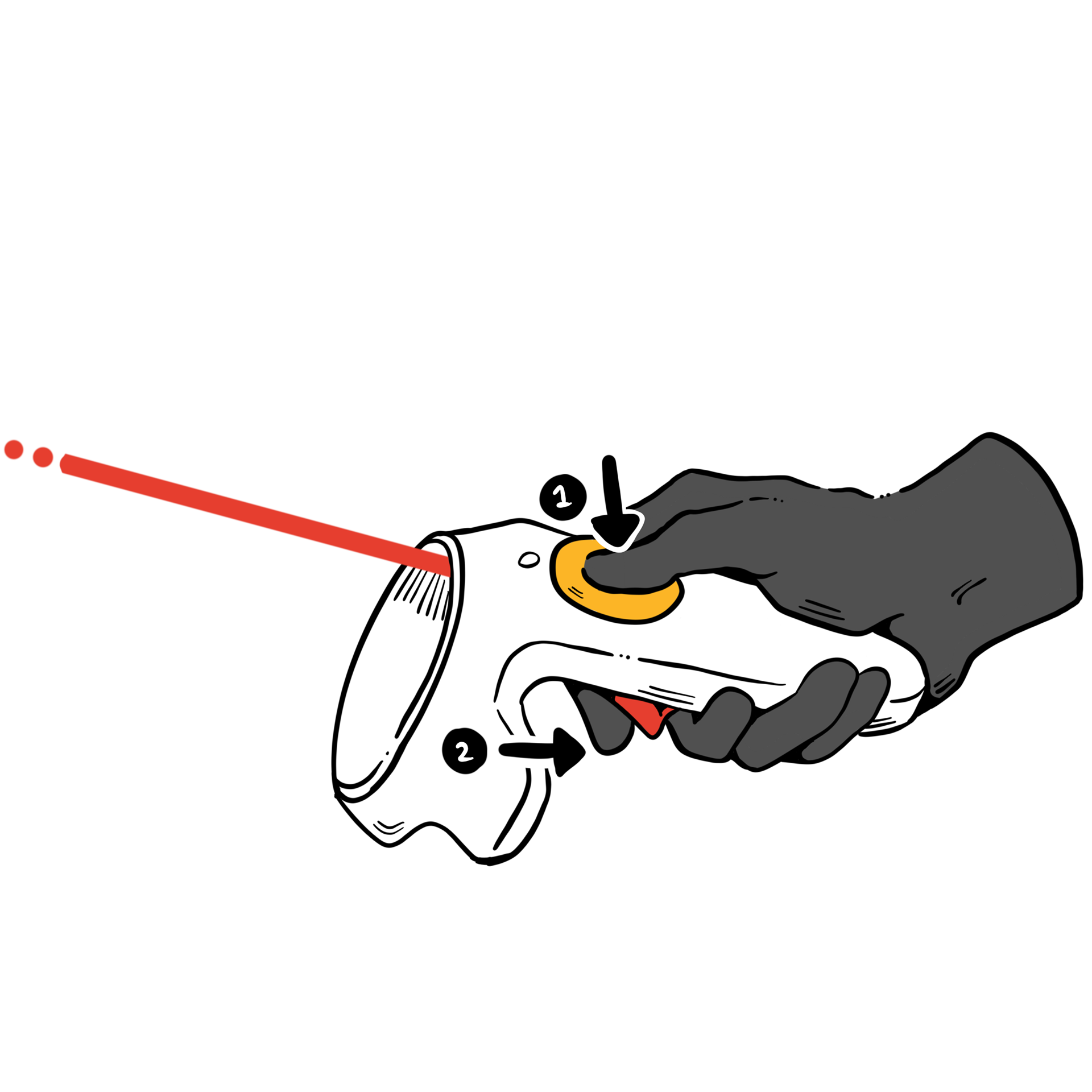
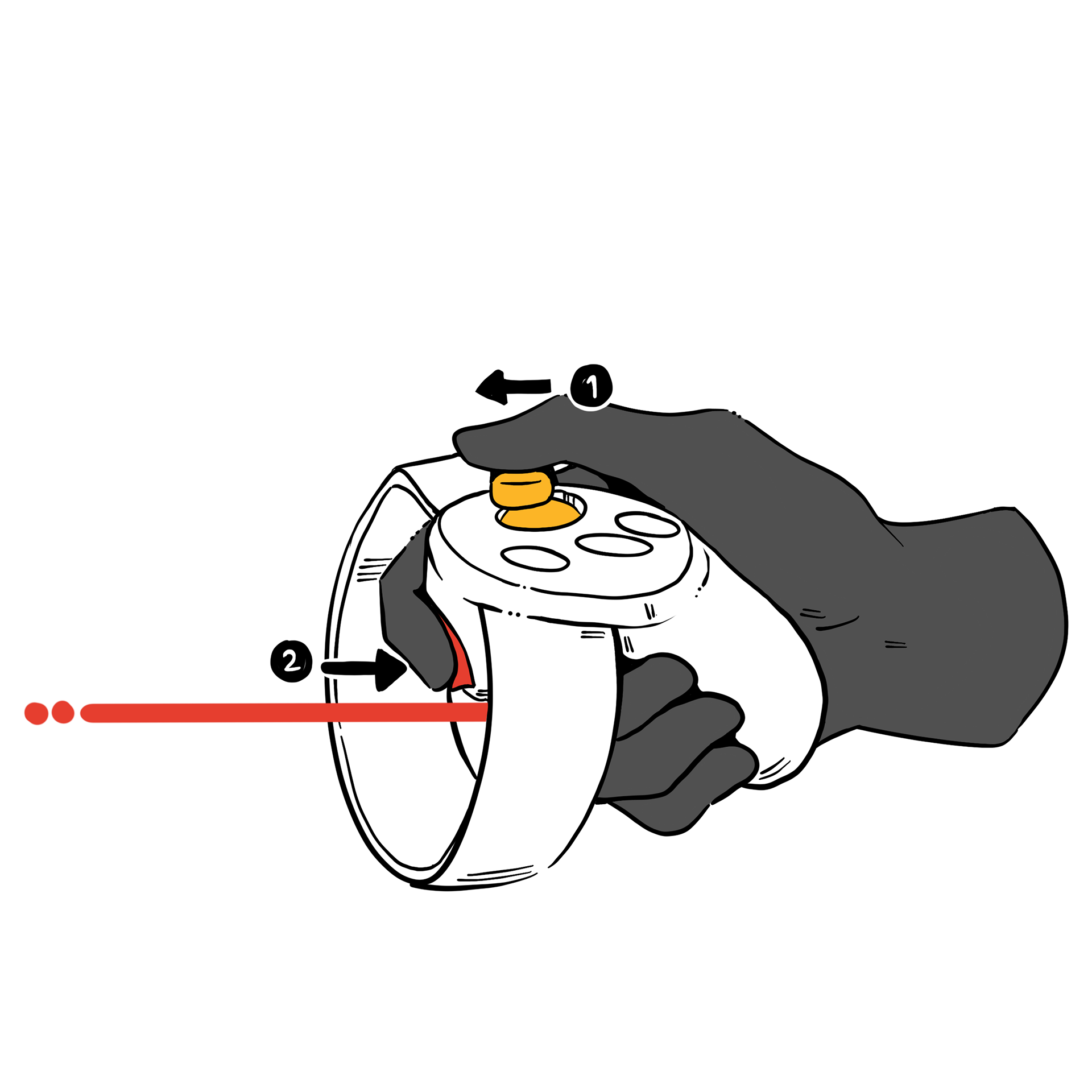
I was assigned to update the web side of the user manual while my supervisor handled the VR side. I laid out all the new implemented features we had to now explain as well as the visual updates of our web platform, making sure to take new screenshots.
It was important to not be overly wordy, keeping in mind the average user's attention span. Often times user manuals are complicated and filled with large paragraphs of text. I kept captions and explanations short, and allowed the large visuals remain center stage.
Google Cardboard Design: Designing for 3D
For Gwydion, it was exciting news to hear that we would finally be able to rollout Arthea to the classroom. However, with Arthea came accompanying equipment. Since the classroom needed everyone to access the 3D virtual reality space, Google Cardboard was the logical solution. The Gwydion team wanted unique packaging for these Cardboards, and I was tasked with coming up with a solid design for printing. The design needed to remain professional since it would also display the University of Michigan block M logo.
I made sure to contact the Dentistry School's communications director for the appropriate logo use guidelines before I proceeded further.
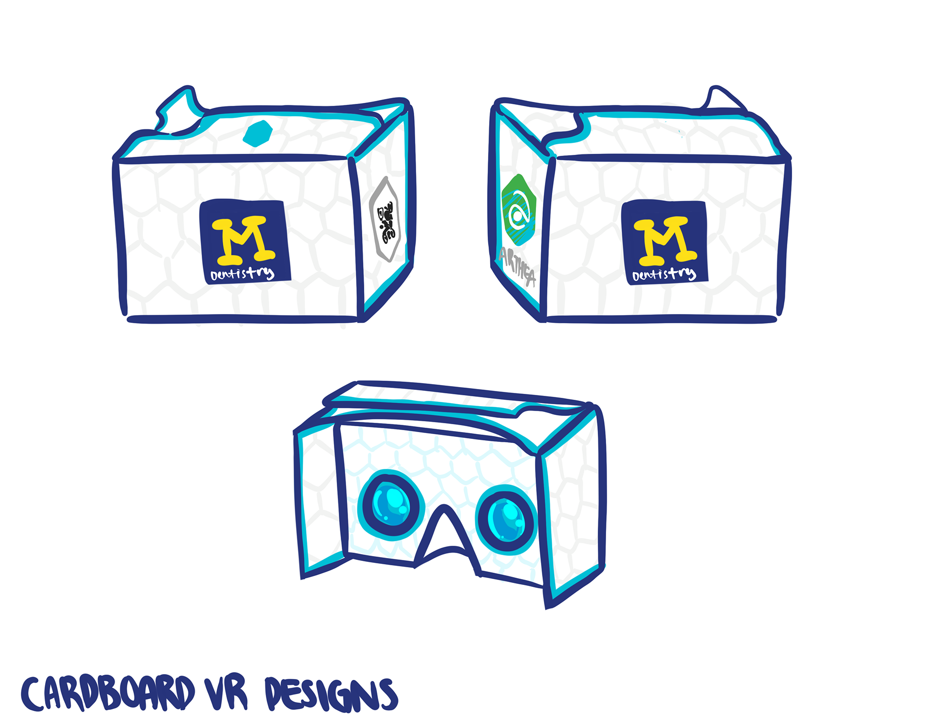
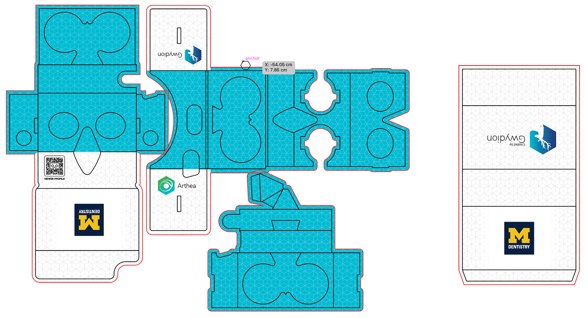
I came up with a rough idea of what I wanted the Cardboard to ultimately look like. I went for a bright look with clean whites and our signature Gwydion blue. The white and the blue accents kept the design clean and professional, and evoked a futuristic feel to the design. To keep a sense of depth and texture, a faint hexgrid was added to the background to prevent the flat colors from looking cheap.
Since the Cardboards are printed then folded up, I had to imagine how the print would fold up spatially, checking and rechecking to make sure the solid blue remained on the interior of the design and only peeked through when folded up. You can see the final laid out design on the right
Final SUMMER Project
Brand Book Design: Establishing and presenting our identity guidelines
During the beginning of the summer I was told that I would eventually be working on creating a brand book for the company. I would be researching, representing and updating the presentation of Gwydion's image in the form of a book. Having never made such a large and complicated style guide, I was intimidated by this project at first. As the summer proceeded, while I wasn't working on the projects from before I was developing and gradually implementing this brand book project.
I first did my research. This meant gathering a compilation of other company branding and style guides. I saw the variation and flexibility of information published and gained a greater understanding of what I wanted for Gwydion's style guide. I made sure to write up who this style guide was for and its functionality. Making sure the use case, functionality, and audience was clear, I pitched the brand book implementation to Gwydion's CEO to show him that this was a reasonable use of resources, making sure to outline the benefits of having a style guide.
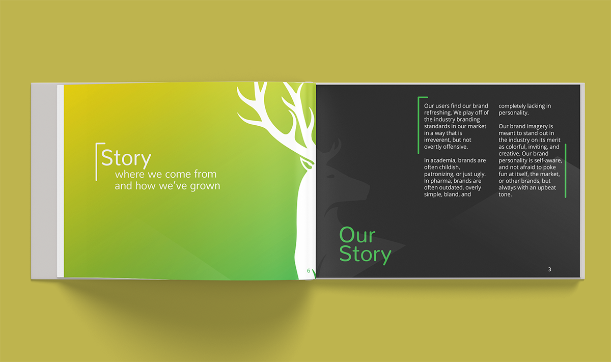
Below you can see the rough draft of how I wanted the brand book to look like. I made rough layouts of how text of different amounts would be presented and the variation of color use. I wanted the brand book to alternate between bright and vibrant headers and sleek dark body text to create dramatic contrast without being too hard on the eyes. Clean and crisp white layouts would be used when explaining the visuals of Gwydion's branding, as I felt as if white was the cleanest and most neutral canvas to present graphics on.
As I developed and created the branding book, I created mock ups of how each page and section would ultimately look. With the layouts and general look of the rough drafts from before, I finalized what each section of the book would look like, using filler text to approximate length.
Below you can see one of my first page layouts I presented.
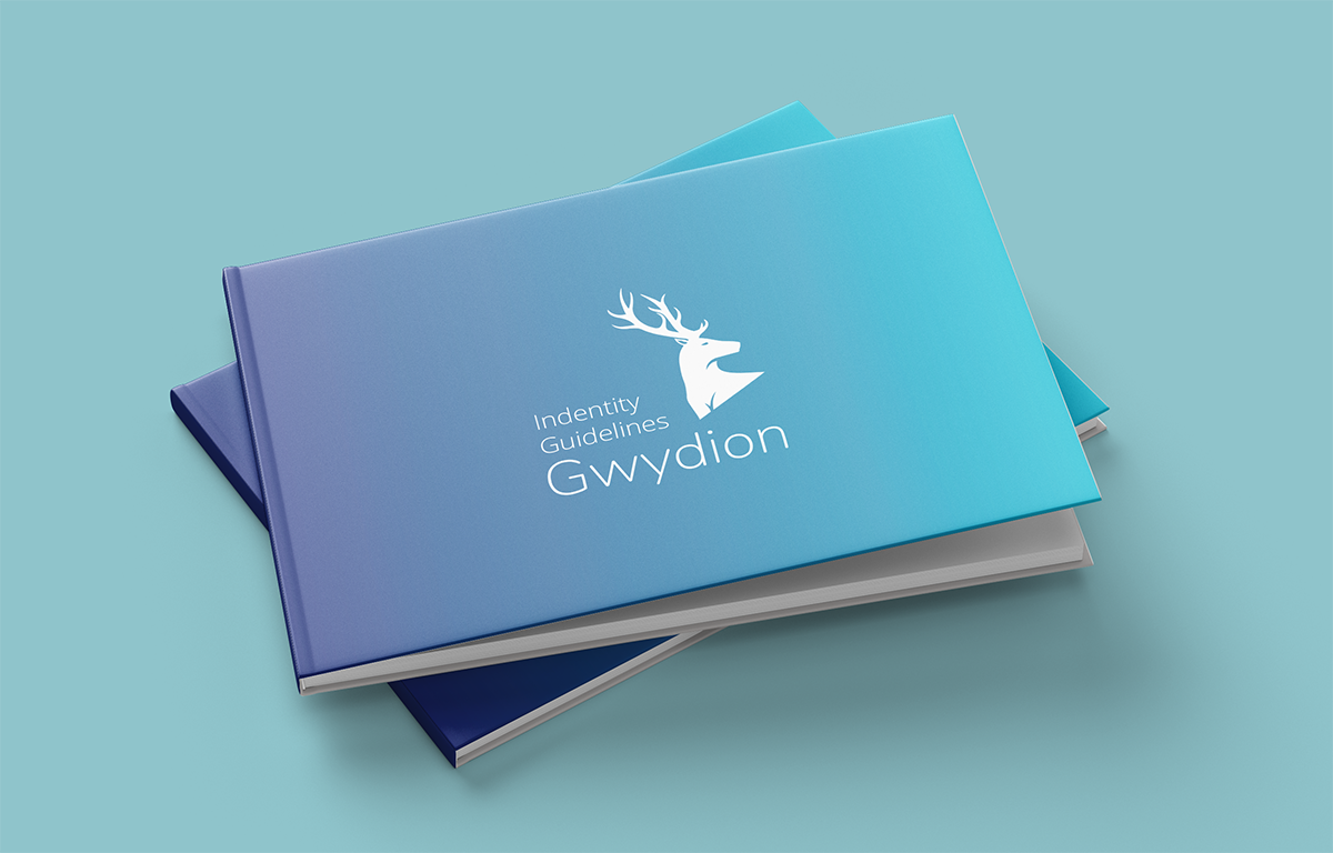
After a suggestion from my supervisor, I proceeded to lay out the pages with a spine and printed format in mind. I added filler pages to create cohesion and a sense of rhythm for readera as they physically flip through the book.
Future
What did I learn and how can I grow?
As I move into the future, my time at Gwydion remains influential in my understanding of how branding impacts real world products. I learned that while branding was a visual practice it is just as user-centric as any other form of design. From this opportunity, I learned how to tailor my design approach and style to an existing brand and look. For design, it's important to be flexible and adaptable so you can design for a variety of things rather than just one niche.
While Gwydion has since closed this was one of my first big opportunities to generate and create content with real world impact. After making tangible contributions to the Gwydion team I can truly say I had a great and fulfilling internship experience and look to this summer as an ideal and example of future work environments and team dynamic I hope to be a part of.
