
POSTER DESIGN
Visual Rebranding: Establishing a bright new look for the storefront
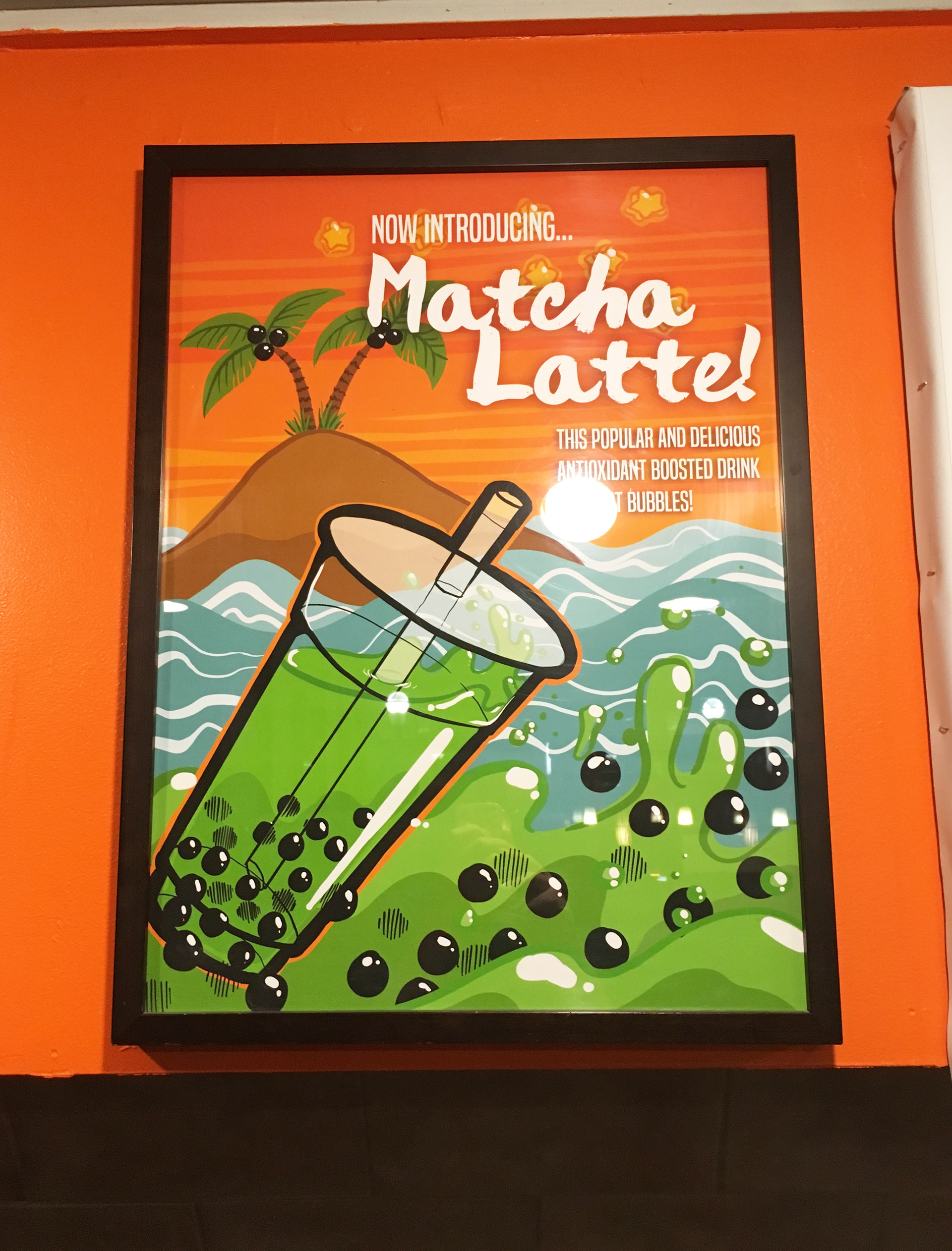
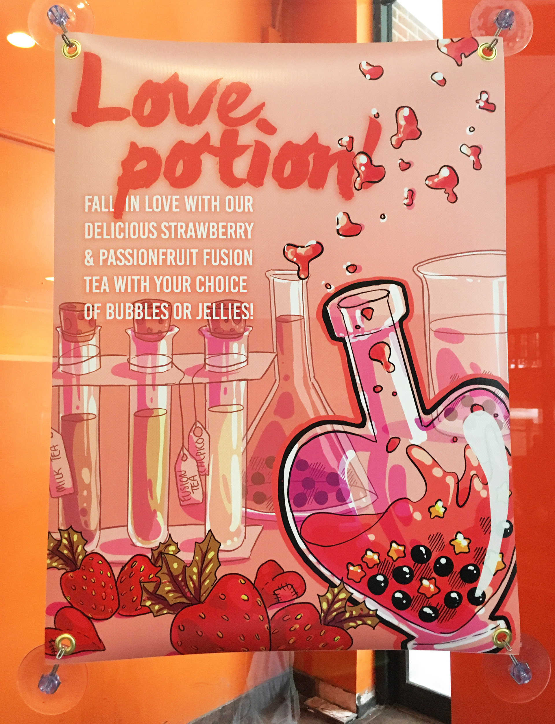
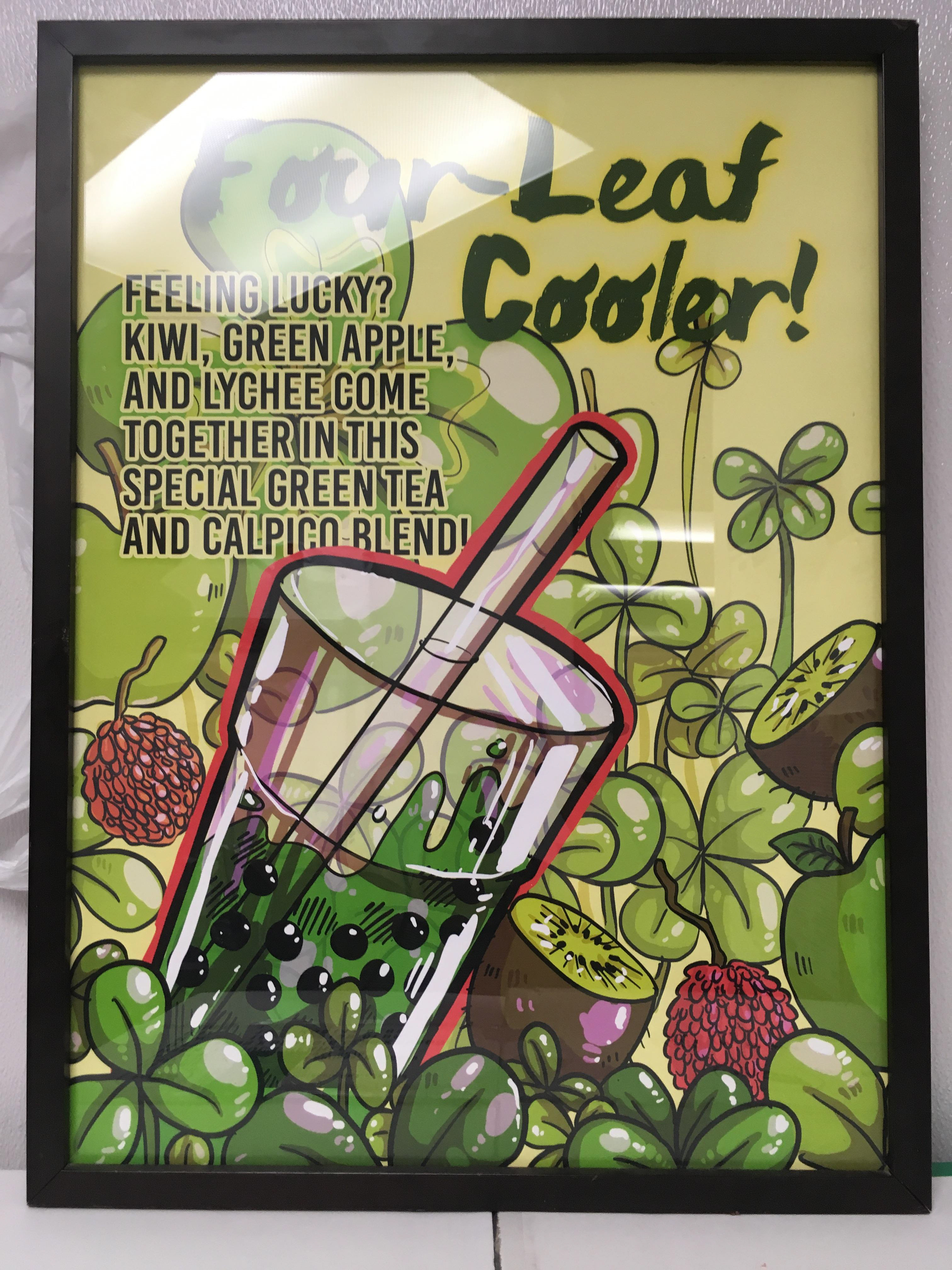
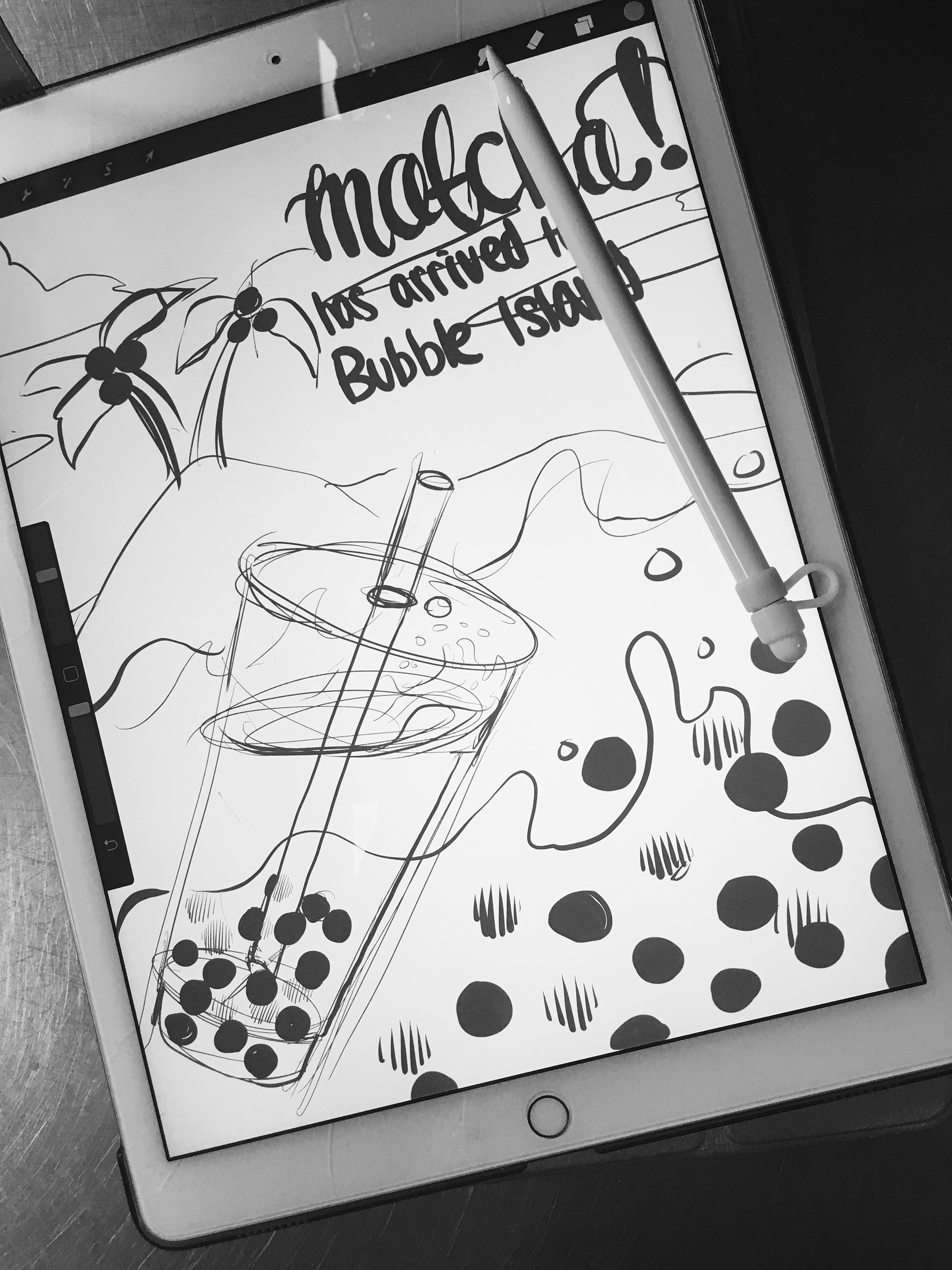
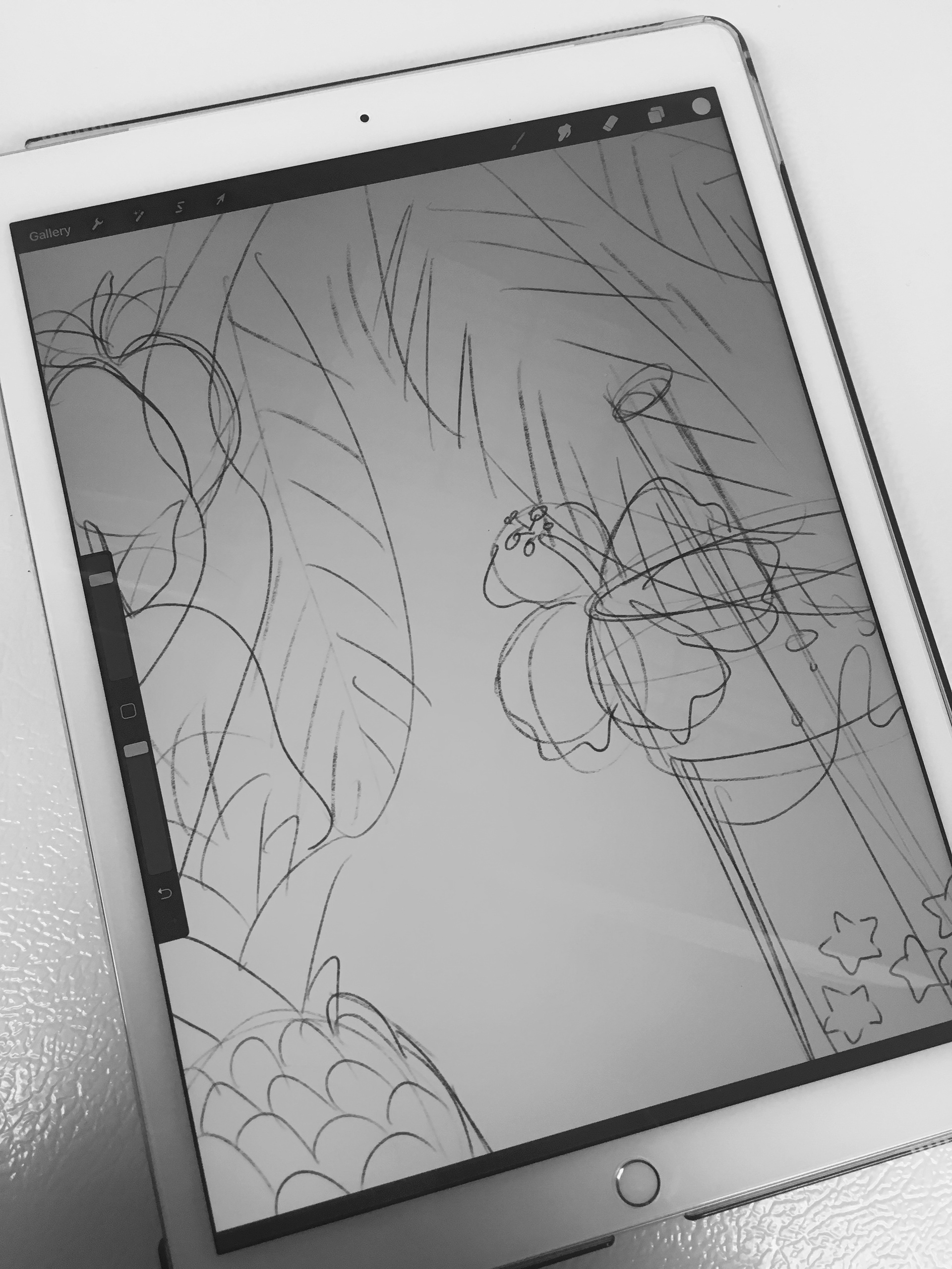
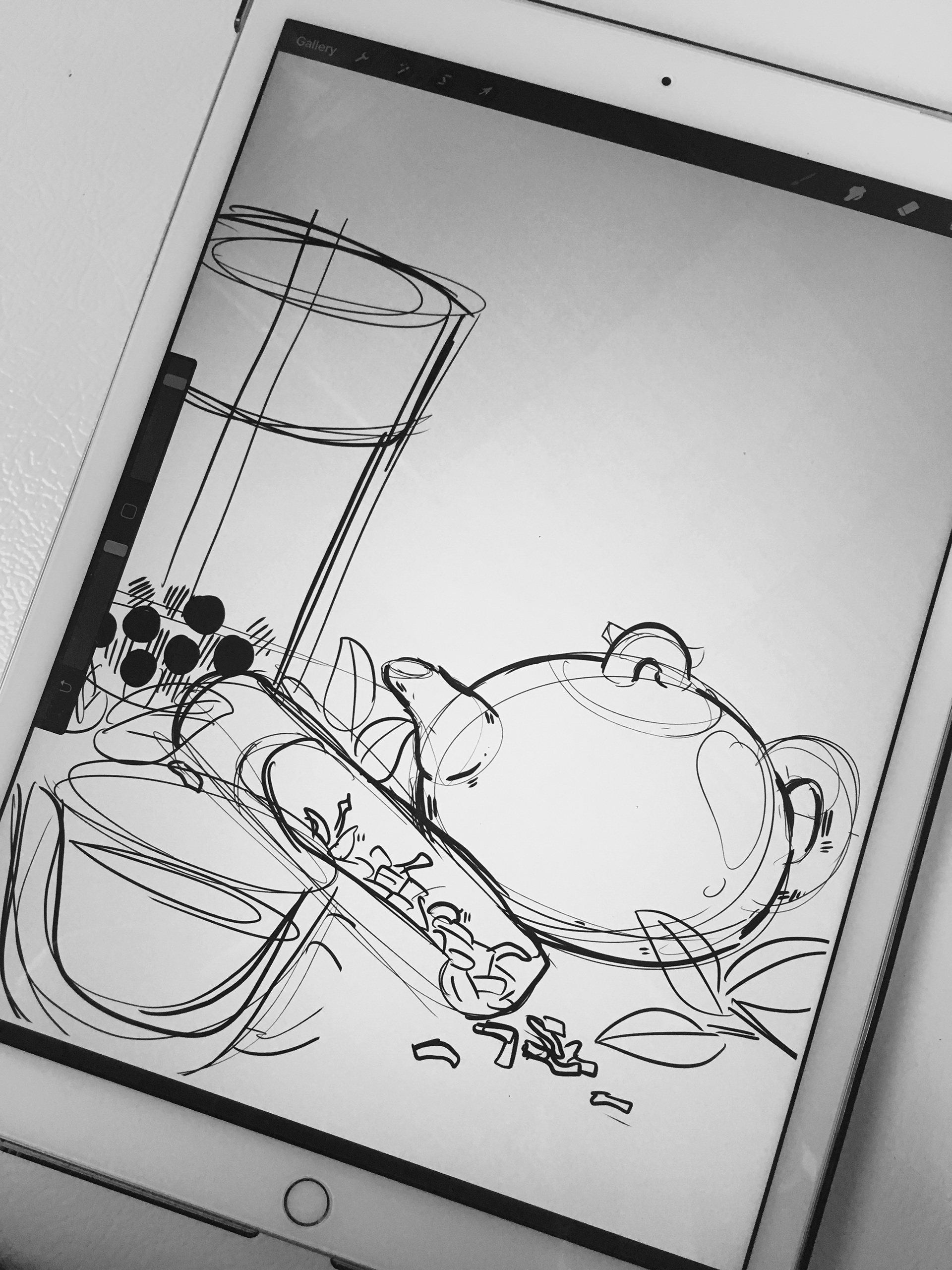
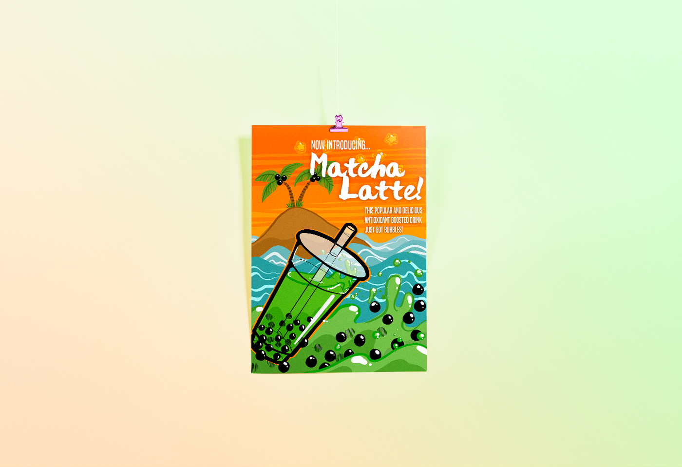
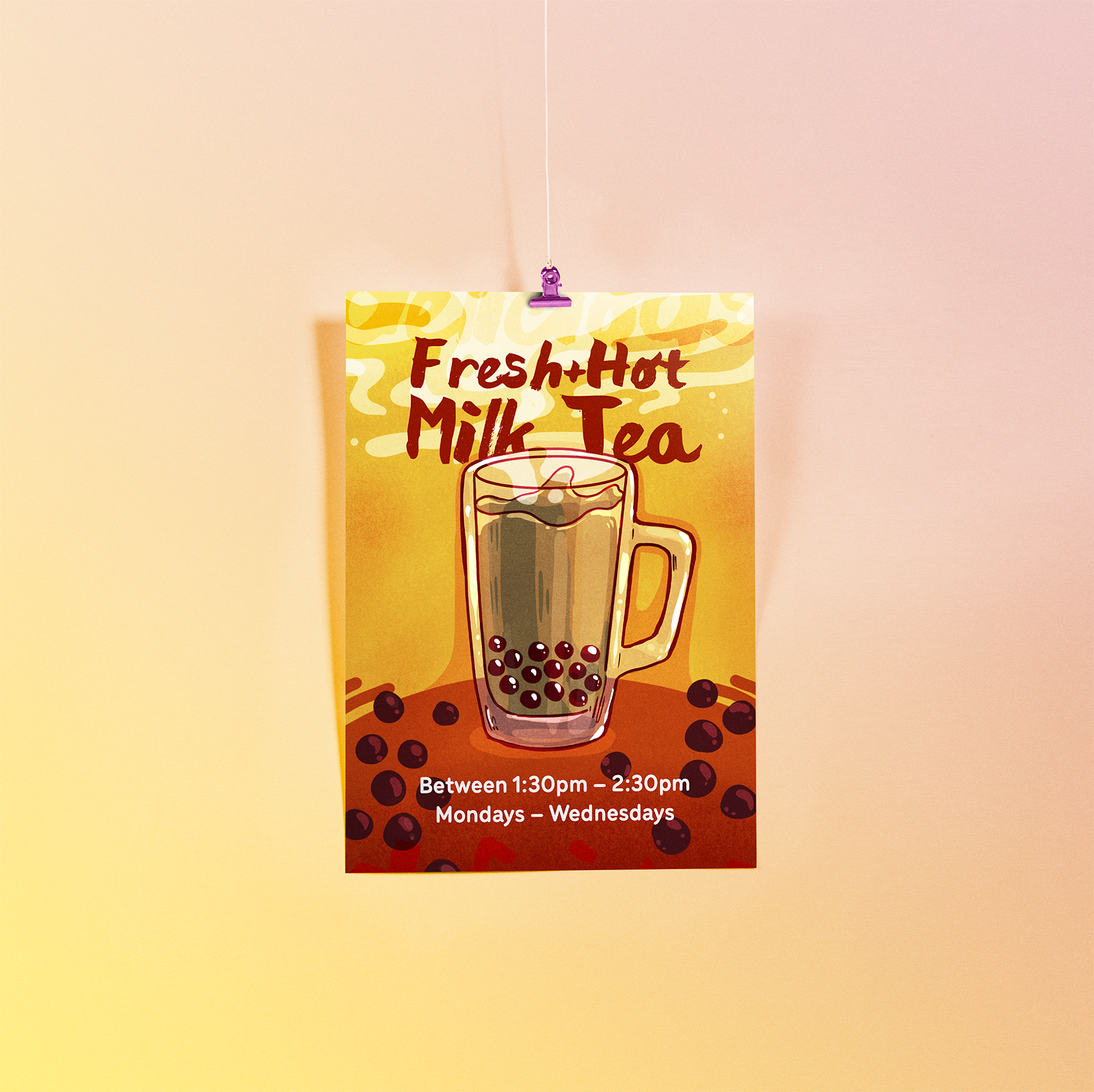
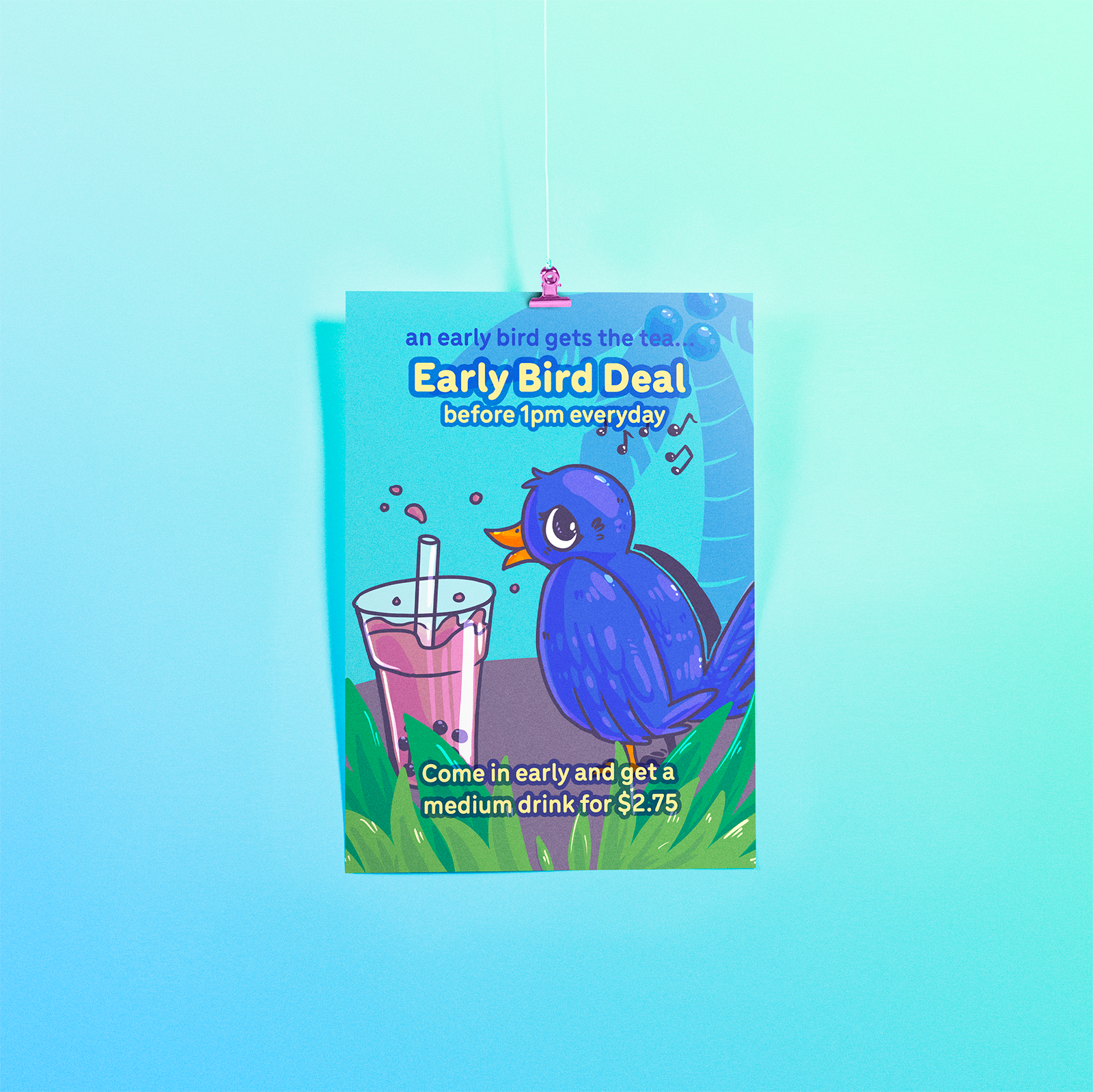
For a while Bubble Island used a whiteboard to advertise their various drink specials and new drink combinations. When they asked me to take the lead in the creative design of fliers and posters for the brand I was excited to establish a new richly illustrative store front to match the bright and vivid Bubble Island Green and Orange. Every poster used original illustrations created specifically for Bubble Island.
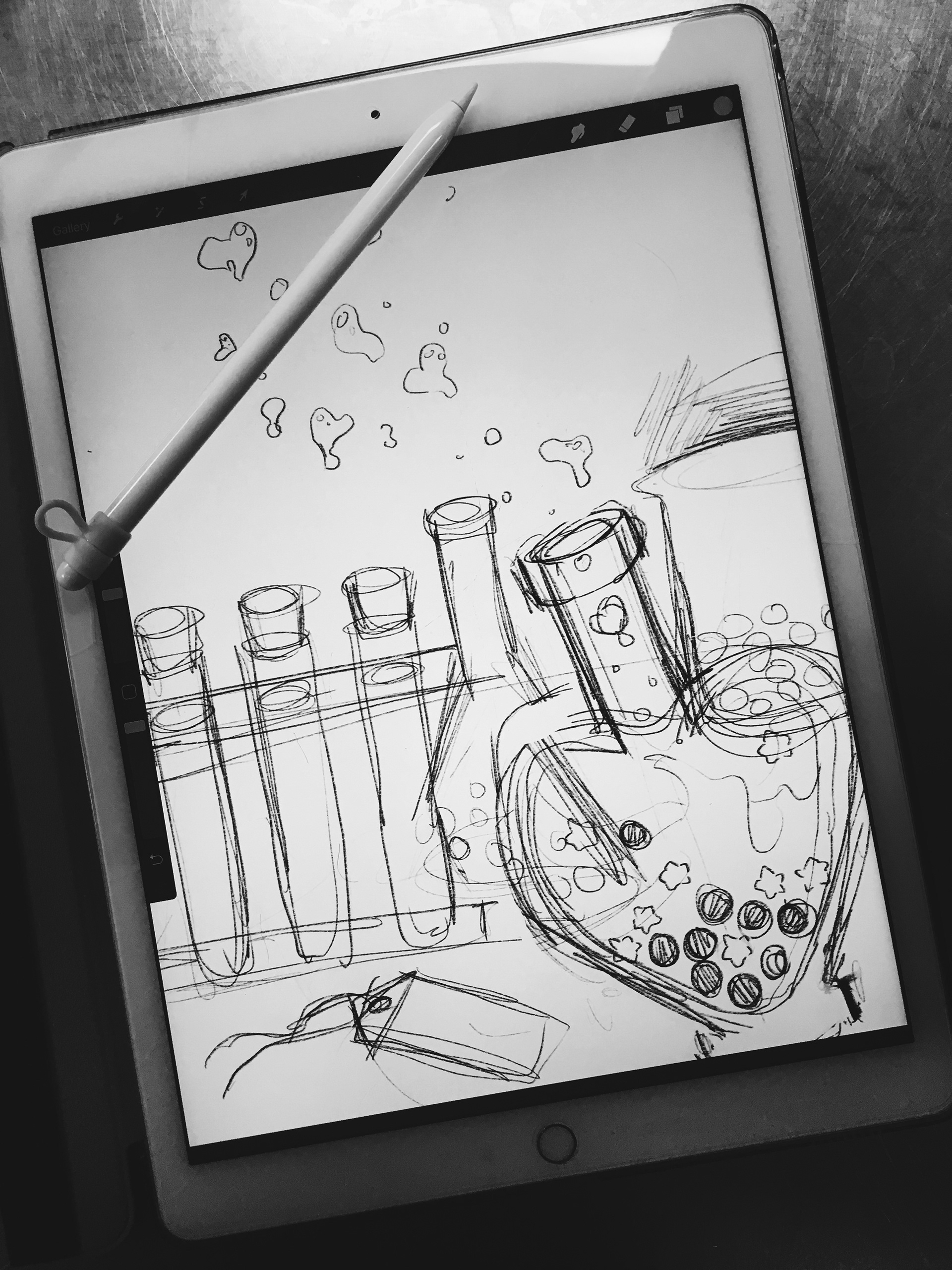
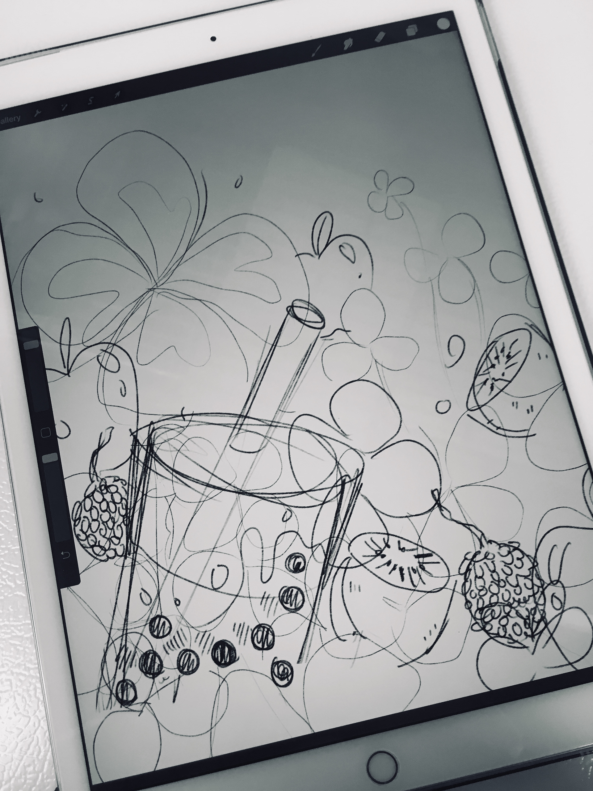
From sketch to final product, I focused on using rich and inviting colors to showcase our new drink specials, while making sure each poster could express the flavors of each individual drink on its own.
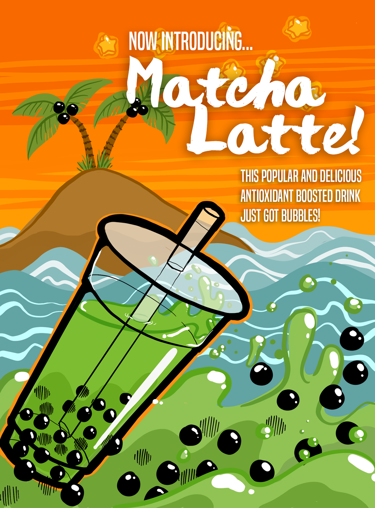
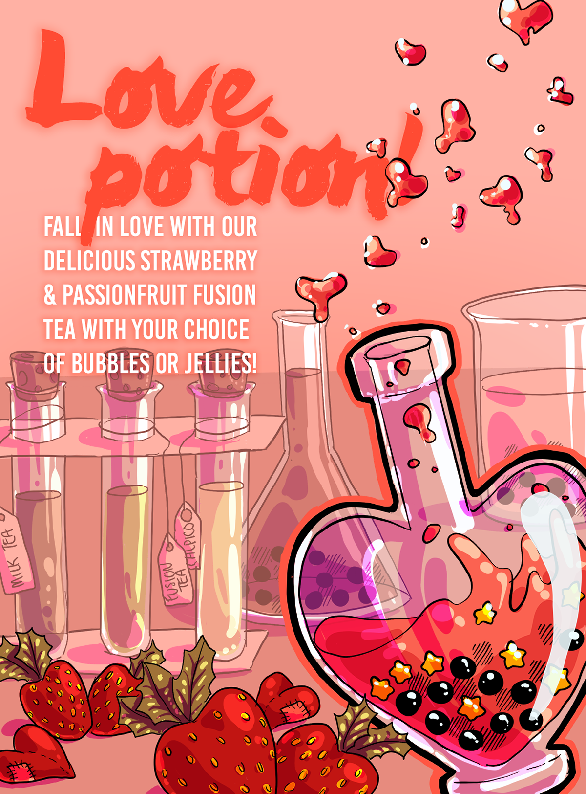
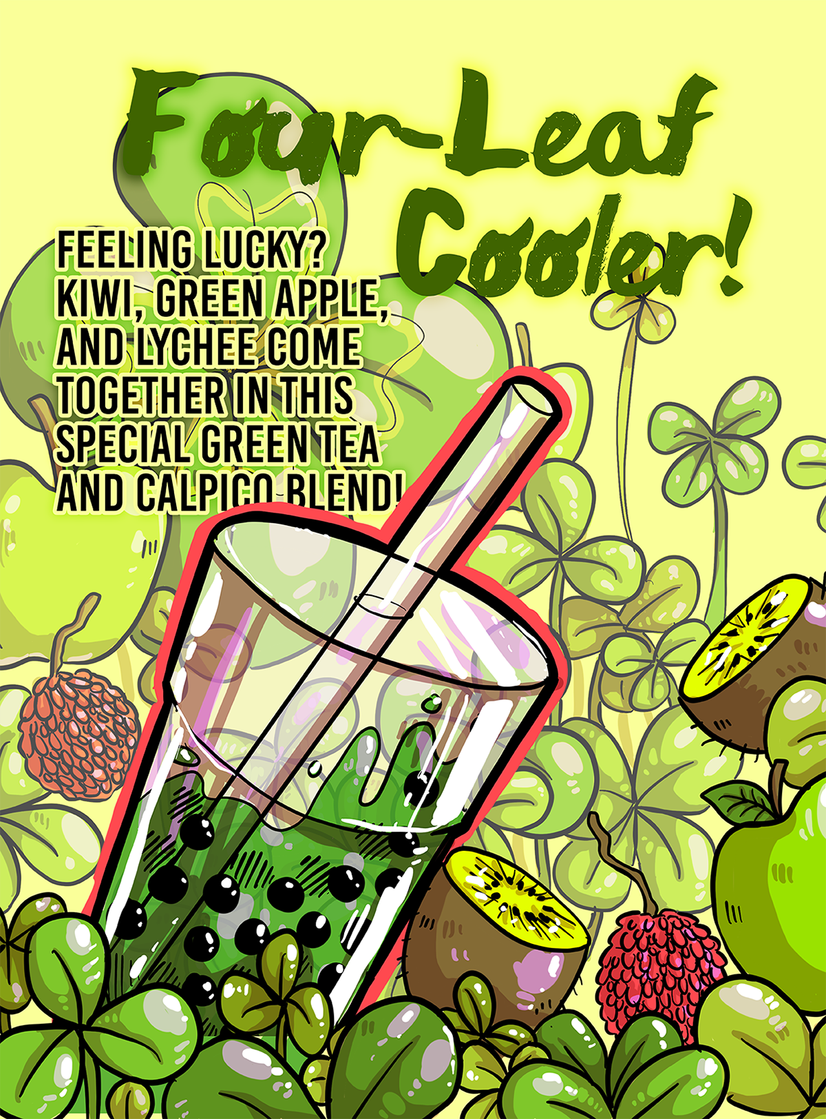
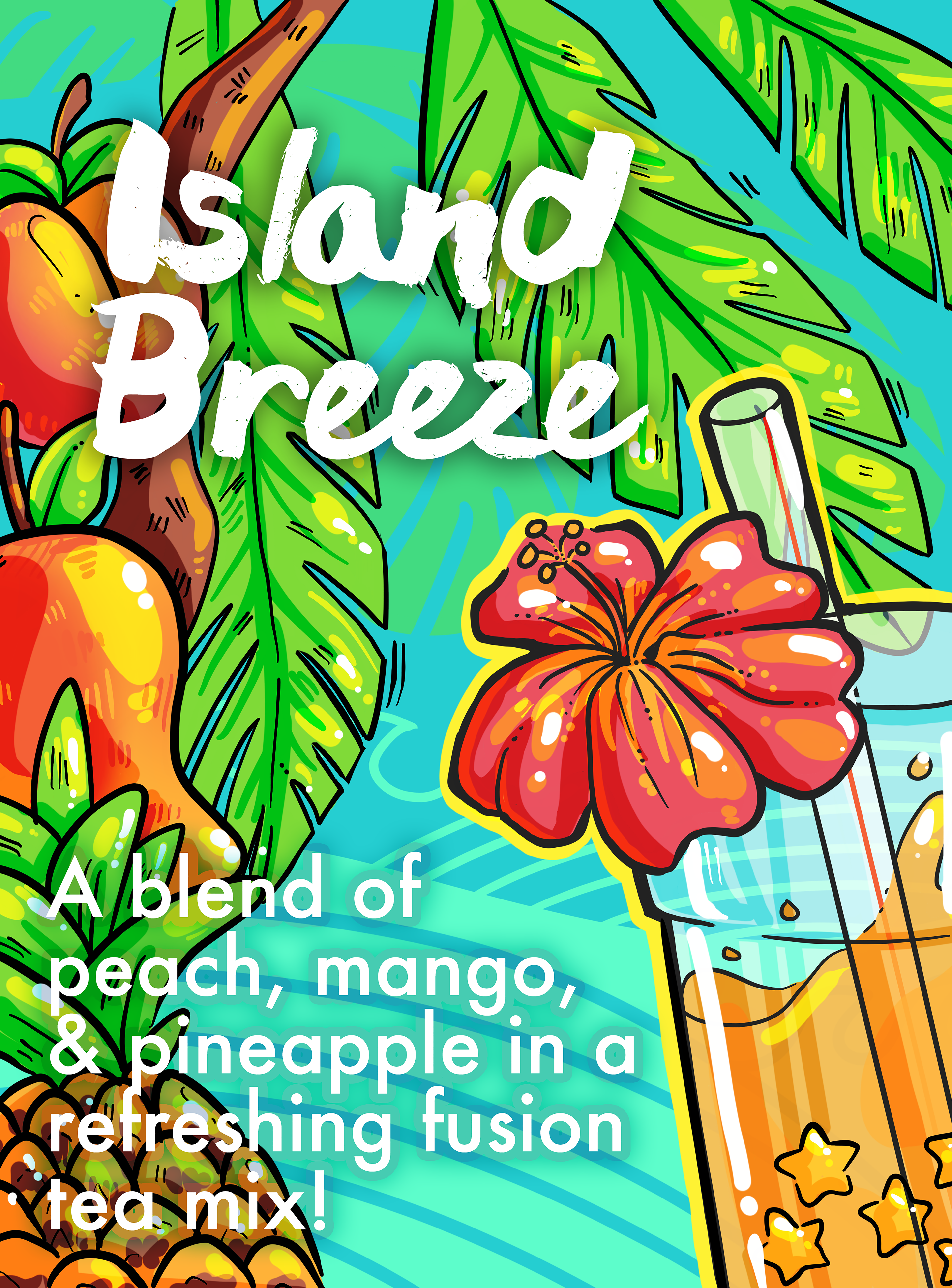
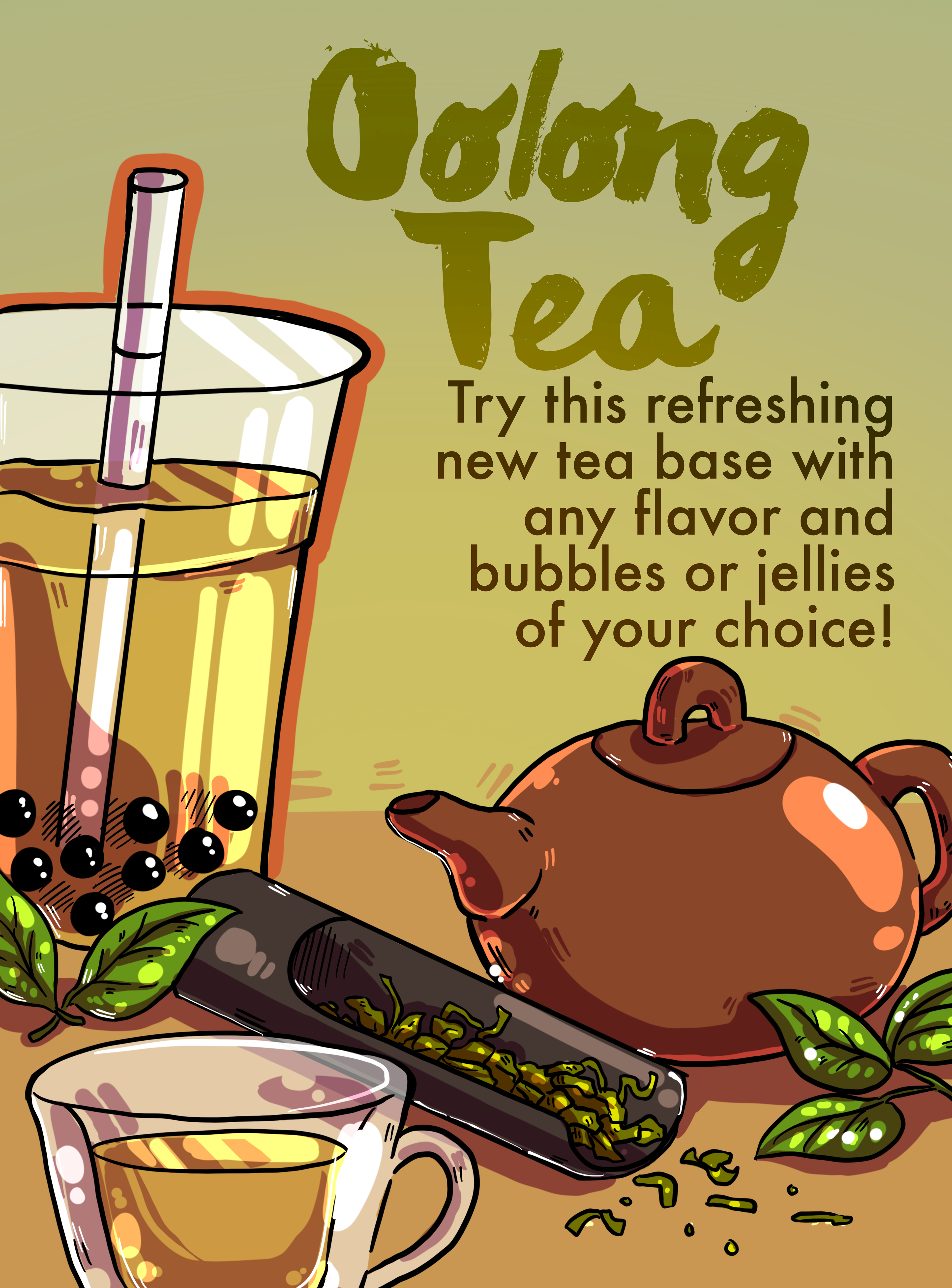
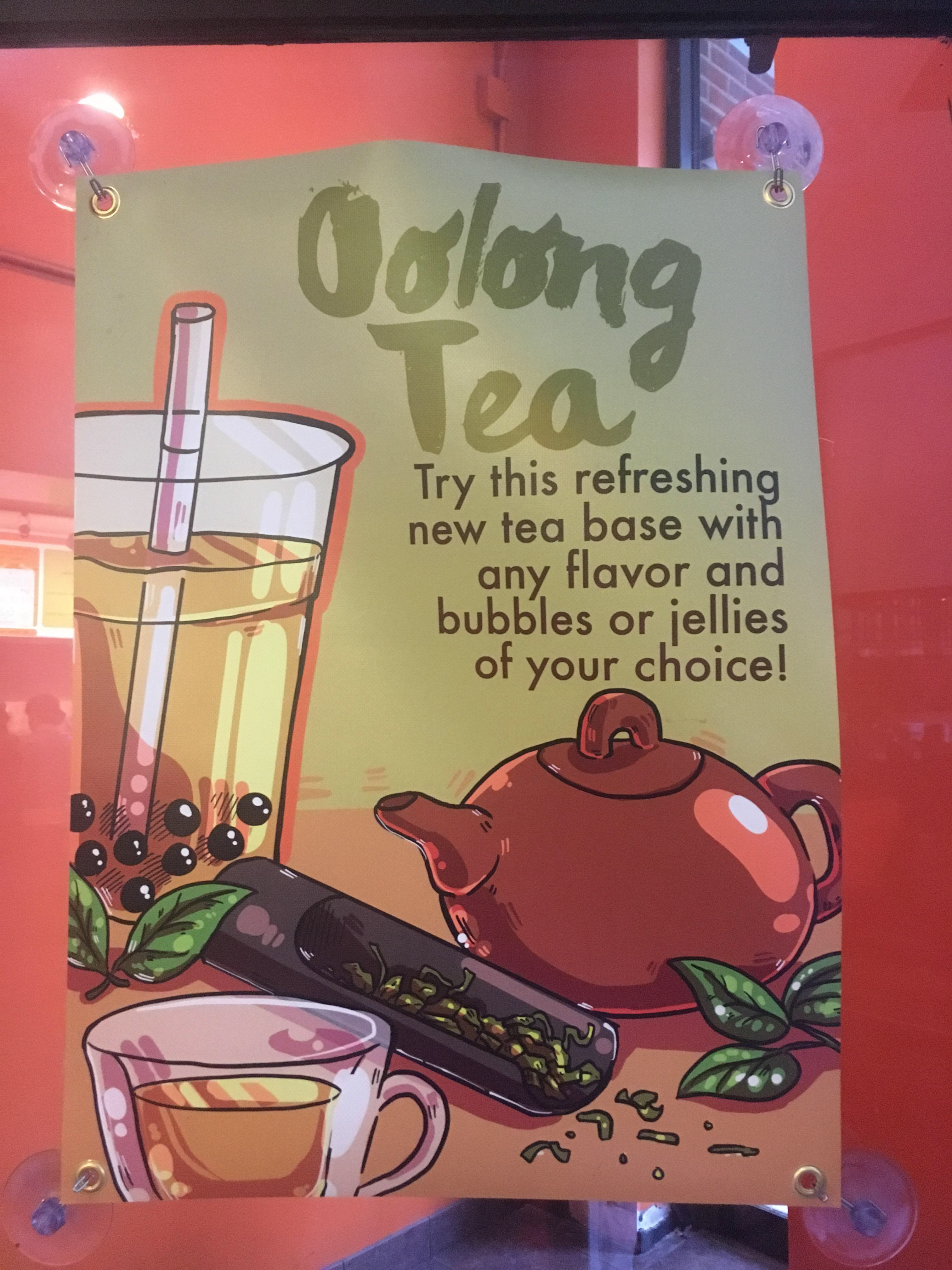
While I tweaked and played with the overall design language, I tried to keep the feel and direction of the graphics consistent throughout my time at Bubble Island. I wanted colors to represent the feeling of each of the drinks even if they were a little bit brighter than the actual drink would look. While most of our drink specials had fun and playful concepts, designing for our then-new Oolong Tea special was a pivot towards a more refined and luxurious look.
As we added more displays, I played with the typeface size more as I learned from previous designs on what was legible from what distance. I had to make sure the content could be read at any of the positions that the poster would be placed from far behind the counter to right up in the customer's face on the front door. I made sure to ask customers what they thought about the posters and if they had any complaints to constantly refine the next design.
Designing for Screens: Making illustration legible in pixels
As we gradually added in digital screens to display changing advertisements and graphics to reflect current promotions or deals, I shifted the designs to feature less text so they would still convey the concept at a glance. Since the digital screens shifted between a rotation of graphics at any given time, the designs had to be concise and visually attention-grabbing.
Menu DESIGn
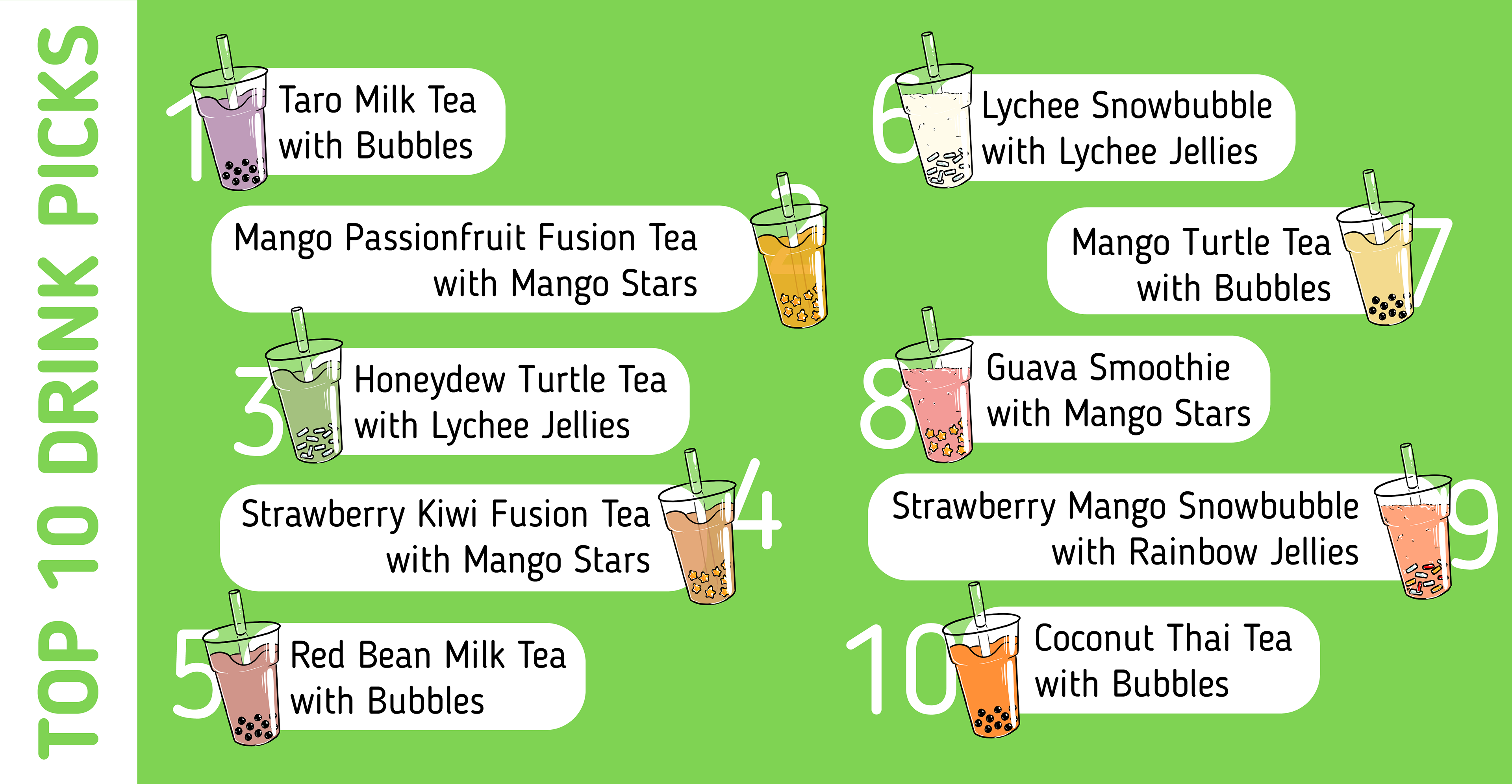
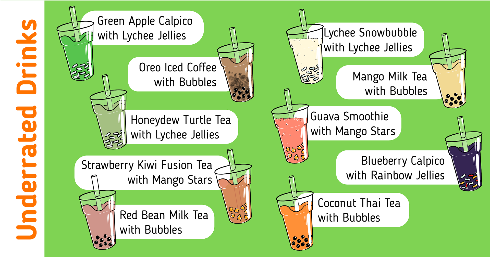
Underrated Drinks Poster: Following a recognizable code
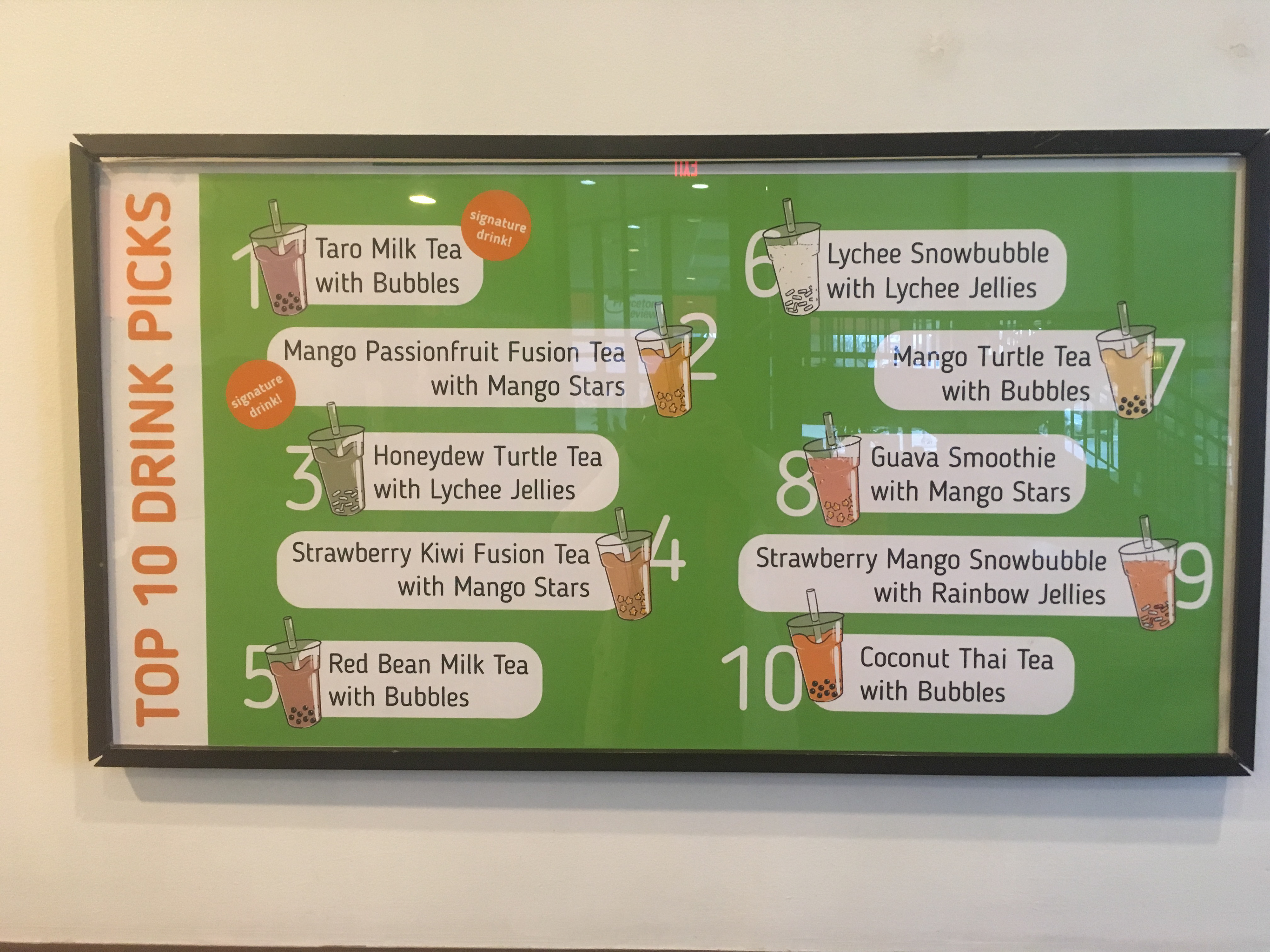
I was also tasked with creating a Top 10 Drink Picks poster to advertise new and delicious drink combinations. Recently, we've made the change to Underrated Drinks to shed light on unusual combinations that customers might not be aware of and can use to explore outside of their comfort zone.
I create a template bubble tea drink to use as a base for all the different variations and combos possible in our menu. This template can be reused and edited over and over again to illustrate any drink possible on our menu. I wanted to continue the illustrated look to our menus from our posters. I used rounded typefaces and corners to follow the round shapes evoked by the concept of liquid and bubbles.
Menu Redesign: Designing for both internal and external users
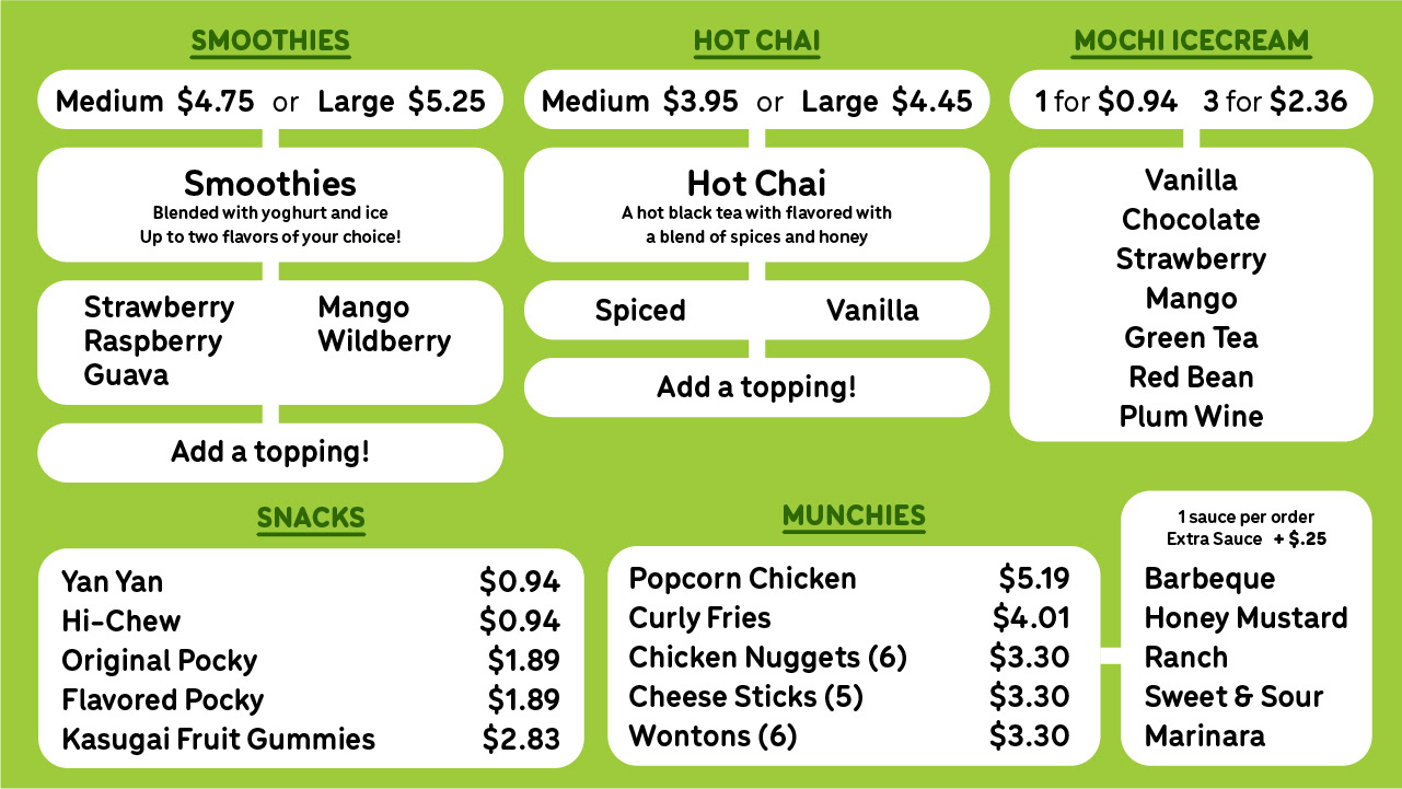
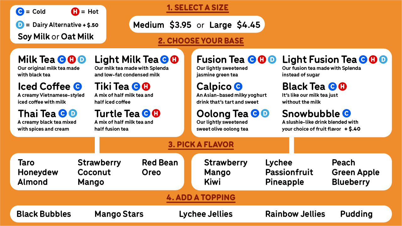
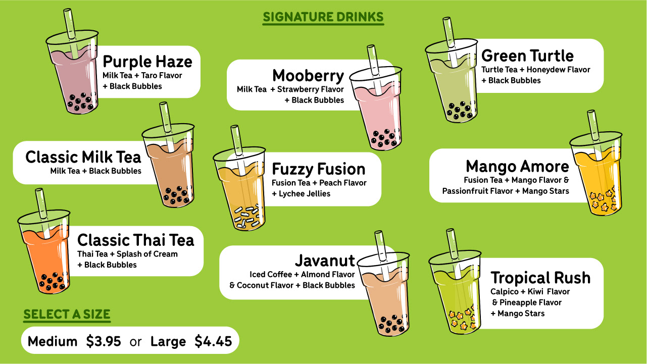
The menu is a crucial part of the storefront language. Serving as a liaison between customers and employees, it conveys crucial information in a neat concise way to streamline the drink making process. There were 4 main sections: custom drink process, frozen and hot options, food and dessert, and pre-made combos (aka Signature Drinks).
For customers, the menu needed to have a description for the different types and options of drinks. It also needed to make alternatives clear as to what could be substituted where. We always wanted the customers to know the wide variety of options they could have at Bubble Island without having to constantly ask employees if such alternatives were available. Prices and add-on prices needed to be clear and accurate. The Signature Drinks menu utilized the bubble tea drink illustration templates that I used in the previous Underrated Drinks poster to be cohesive.
For employees, the menu needed to effectively summarize what all of the customer options were so less time was spent going back and forth between the customer and the employee. The custom drinks menu specifically helps streamline the drink making process by using a step-by-step system that way customers can read off what they would like efficiently and accurately. Employees wanted the menu to help customers choose more quickly as well as cut down on commonly asked questions that they used to have to explain over and over again.
To best balance the needs for both user groups, customers and employees, the menu uses little flowery language and lines to create a flowchart-esque look to guide customers. Space was a little tight as we only had three digital screens to use.
Menu Redesign: Future improvements and thoughts
For future iterations, having had time to implement and test the menu design, I would refine a couple of things. I believe taking out the small descriptions of the various drink bases would be better. It would give more space to the other menu elements to be enlarged as I want the text to be as easily read as it can. Then the menu would be supplemented with laminated physical menus that could be handed out at the corner or at the beginning of the line near the door, which would include the lengthier descriptions so customers could read them easily if they wanted to.
Overall, this menu redesign taught me a lot as it was constantly being tested by users on both sides. I had strict restrictions on what I could do at the space I was given and the distance at which the menus would be read. This design process was very similar to what digital UI/UX design is and utilizes a lot of similar concepts. It taught me that user based design should not just be considered in tech-based products but everything we use.
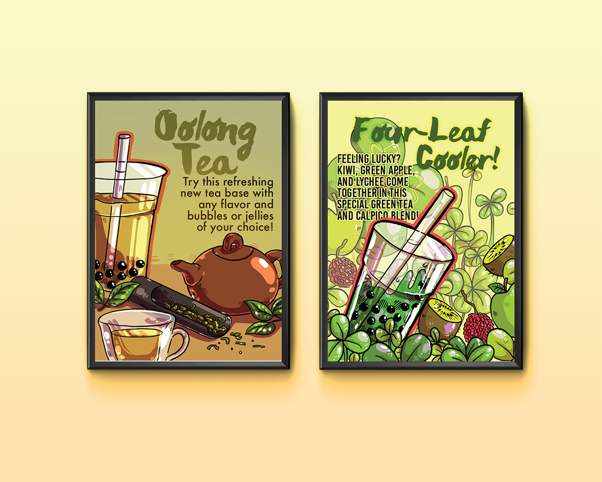
Live Examples
Here are some examples of my illustrations and designs being used as printed posters in and around the storefront.